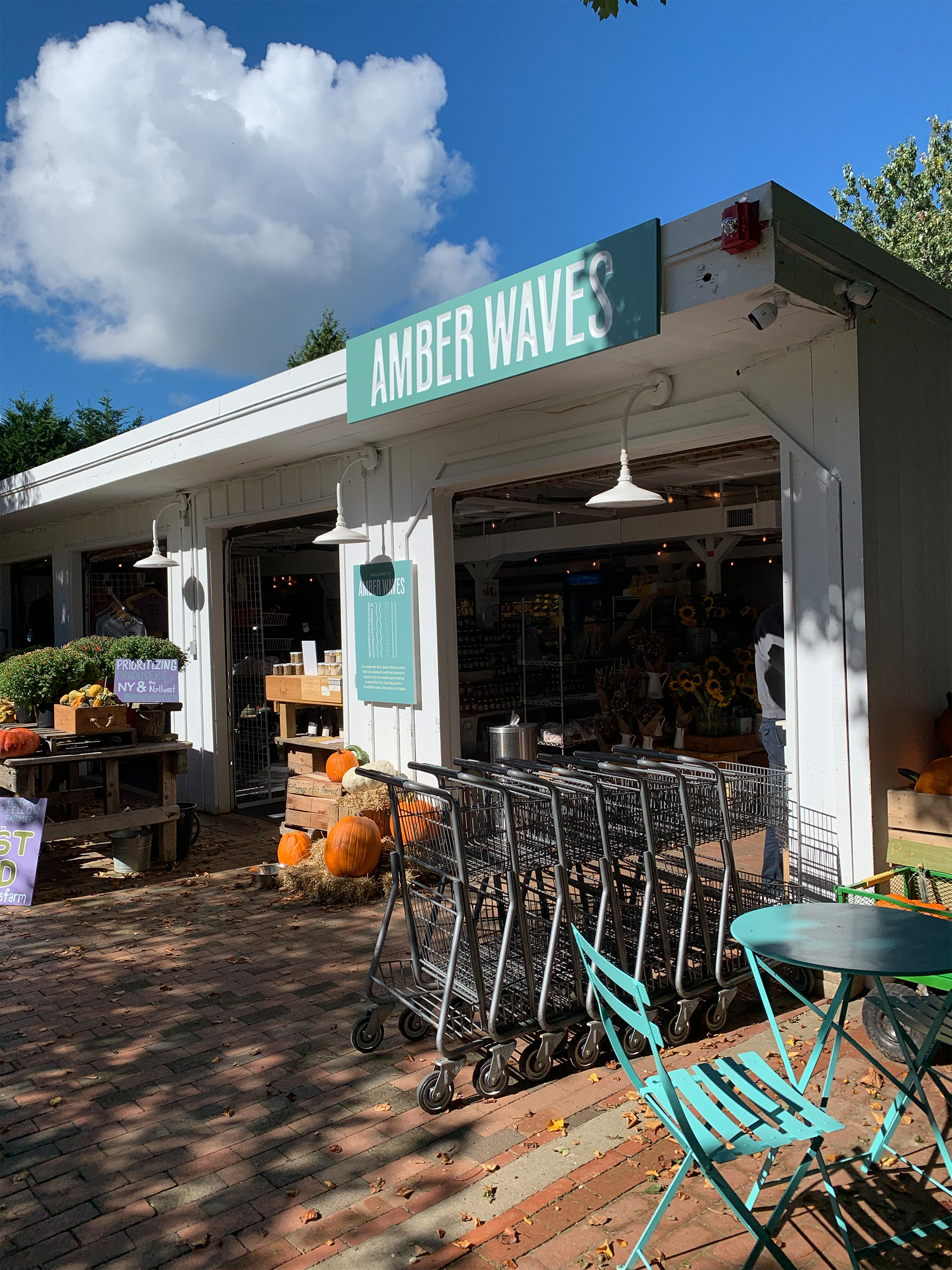
Amber Waves
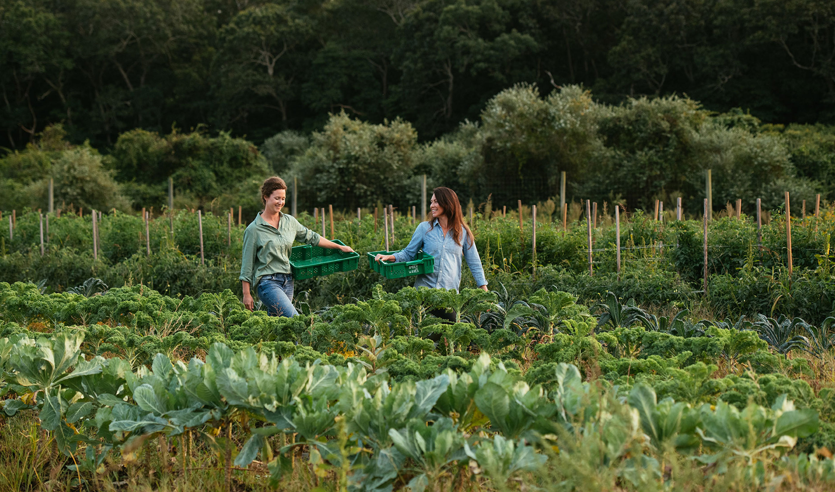
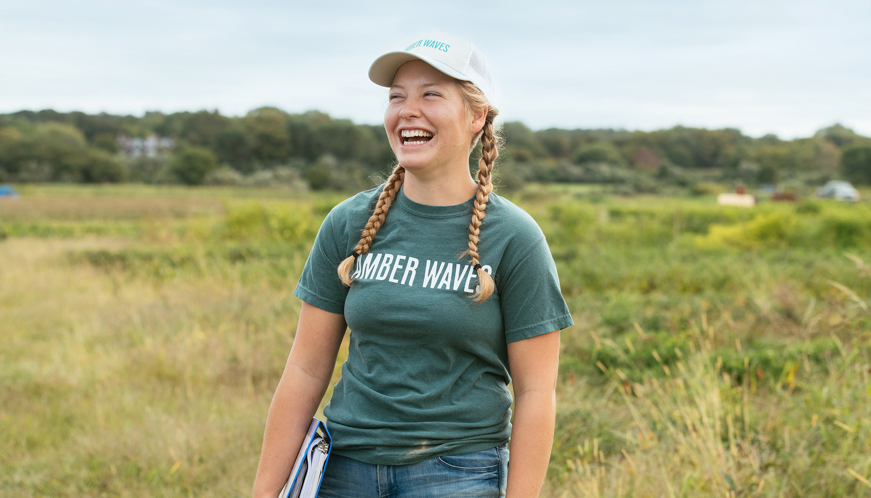
An ocean-side farm in Amagansett, NY, Amber Waves is women-founded, predominantly female-run, and a magical place for anyone who visits. After 10+ years in business, they were in need of a brand audit and evolution. Experientially, their brand equity was stronger than ever, but the language, tone, and visual identity needed to reflect this. As the farm extended beyond the land it was time to establish a consistent visual and audible presence.
Role: Lead Designer, Illustrator
Studio: MA’AM
Creative Director: Sharon Taylor
Managing Director: Kristina Unker
Photographer: Gabriela Herman
Copywriting: Antonym
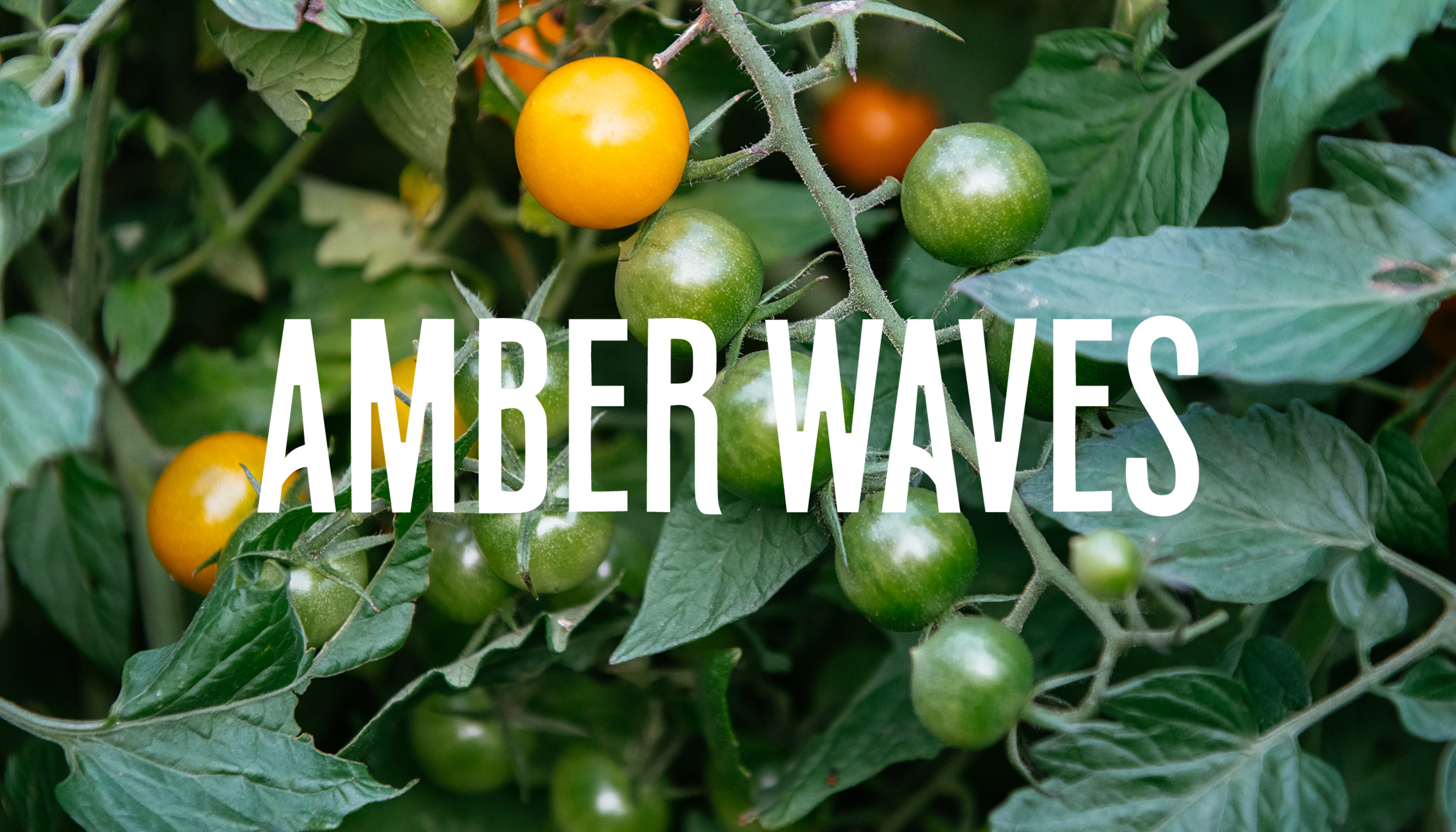

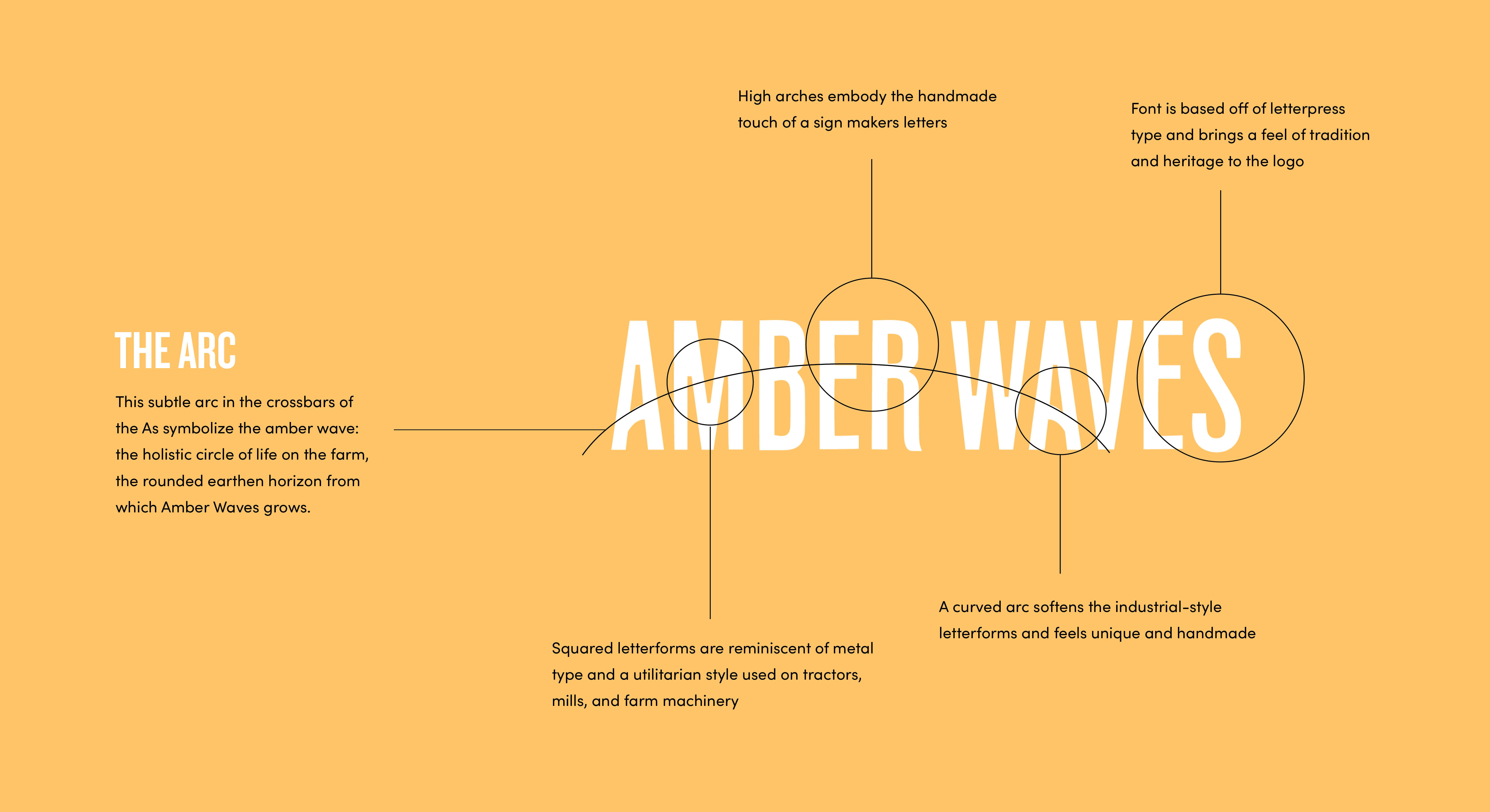
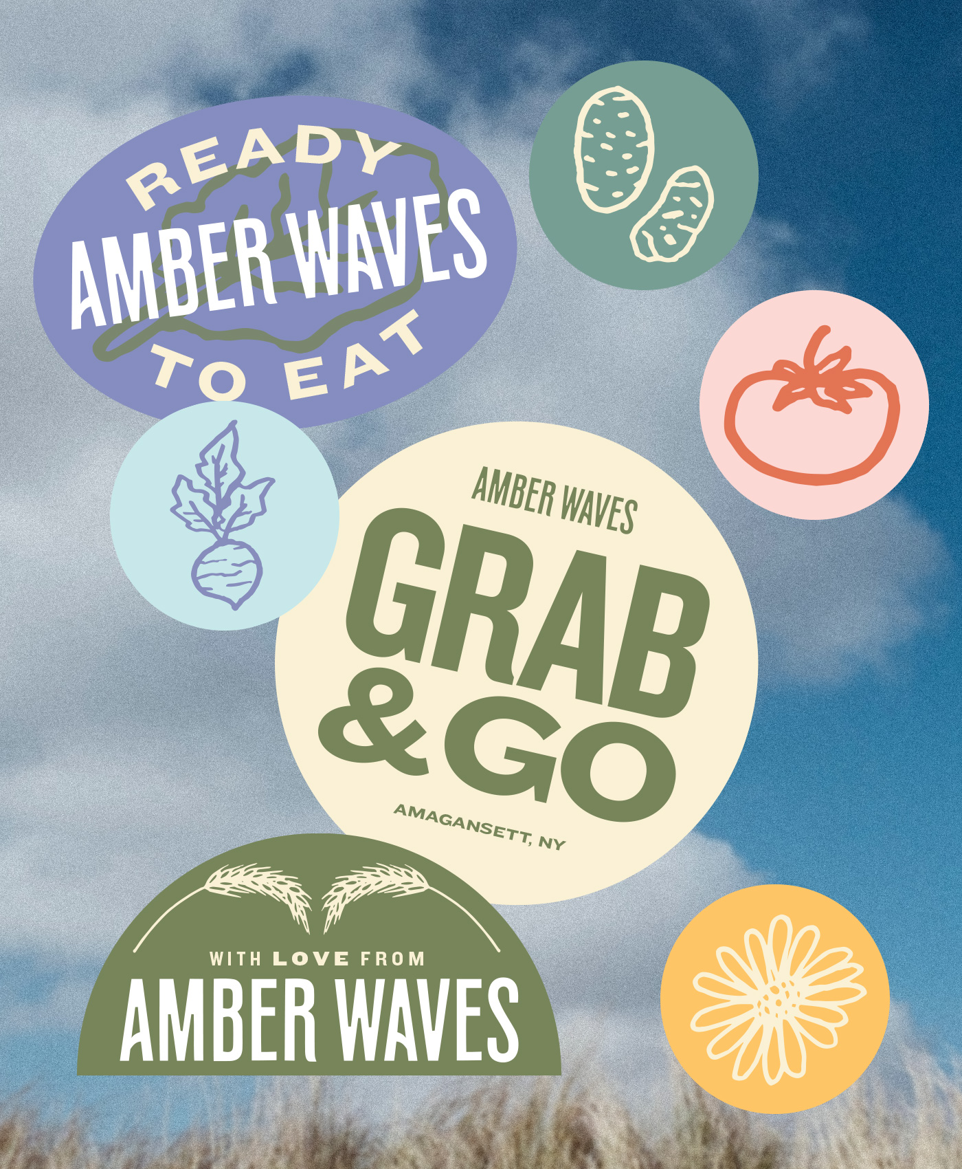
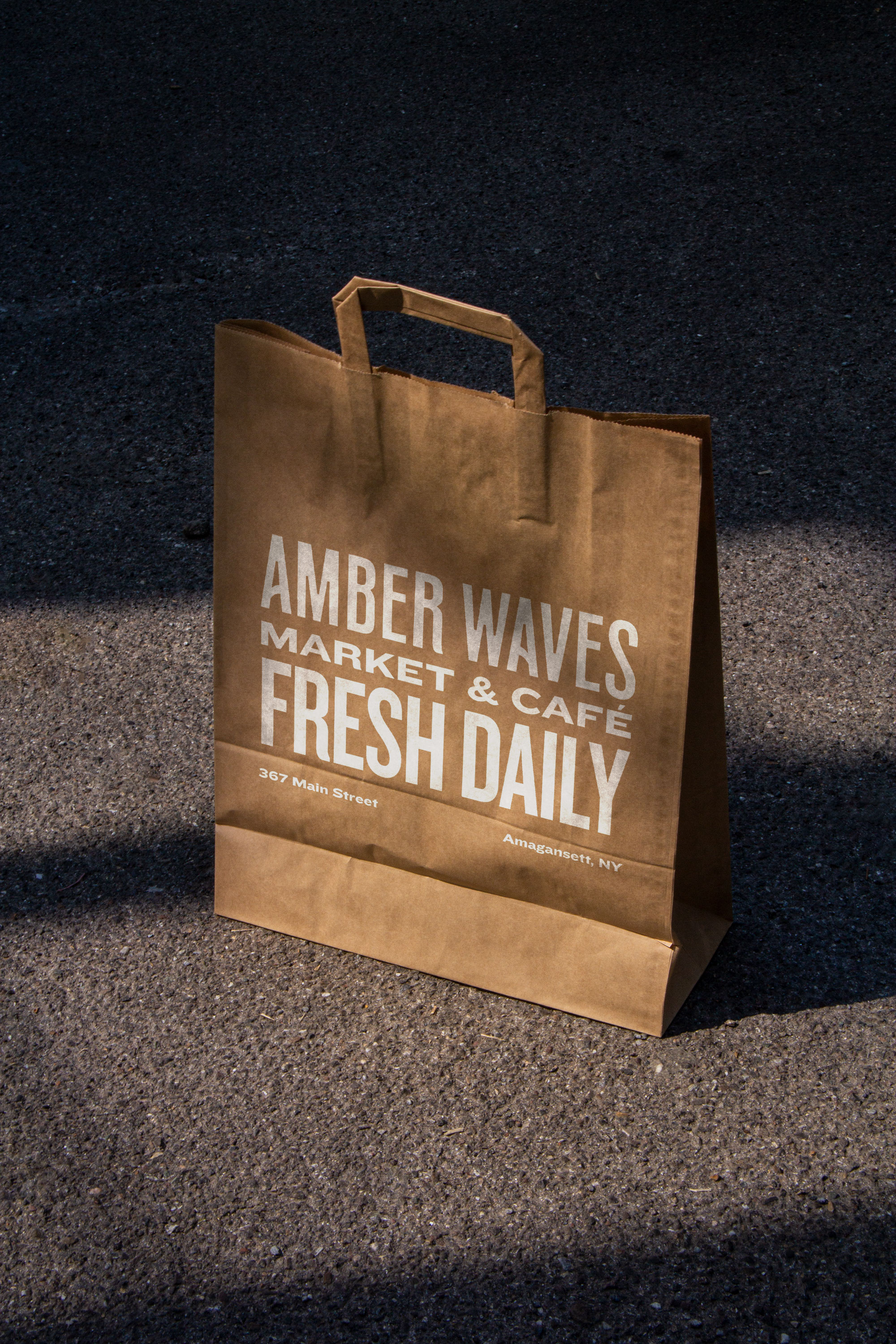
To ground the identity, we sought inspiration from legacy general store marquees that employed striking typography in varying weights. The result embodies what happens “between” the Amber Waves, specifically: a rich heritage inspiring a new generation and the passionate embrace of community, local agriculture, nourishment, and joy.

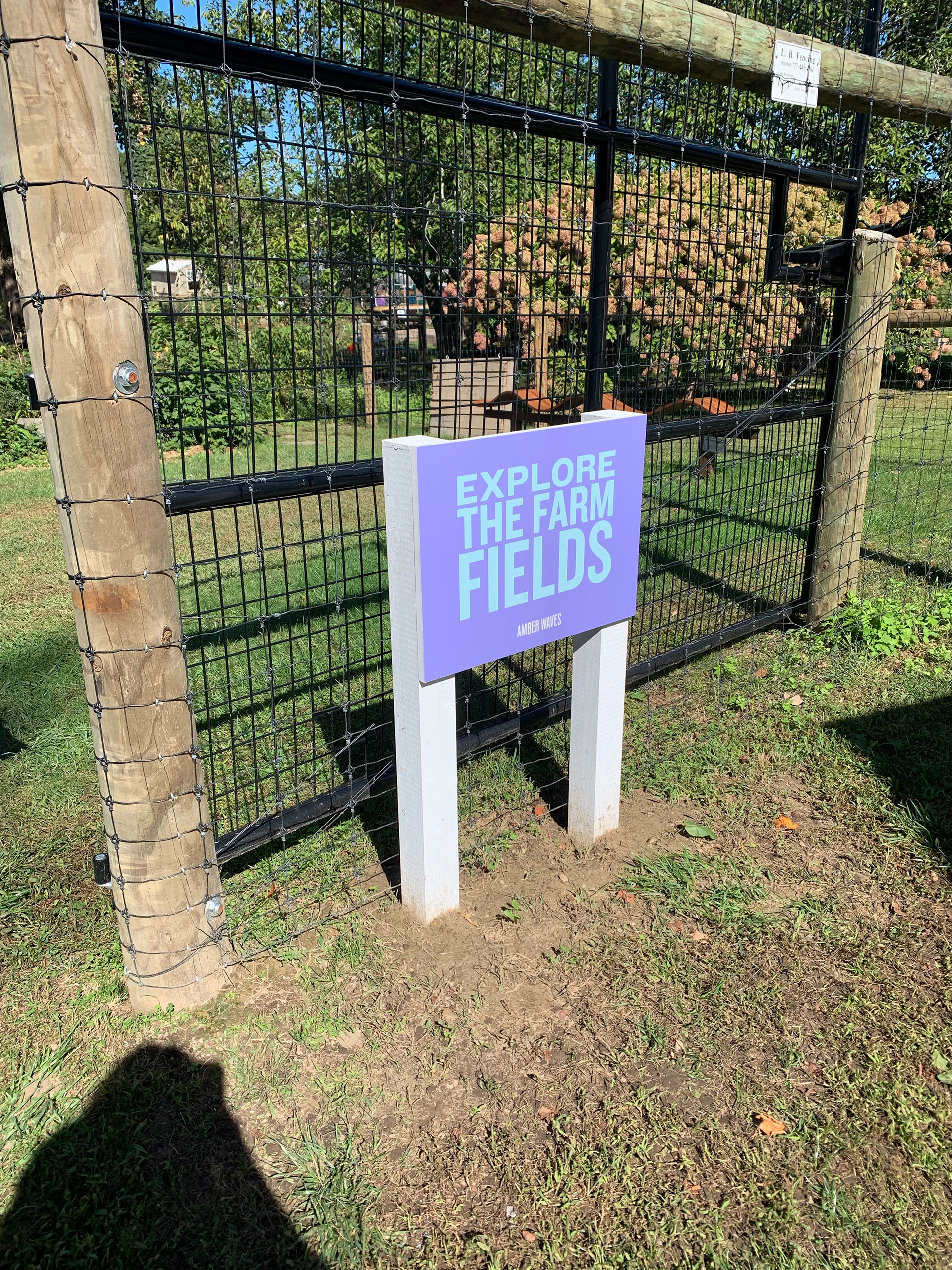
The brand architecture was also designed to support each branch of the company with its own hero colorway.

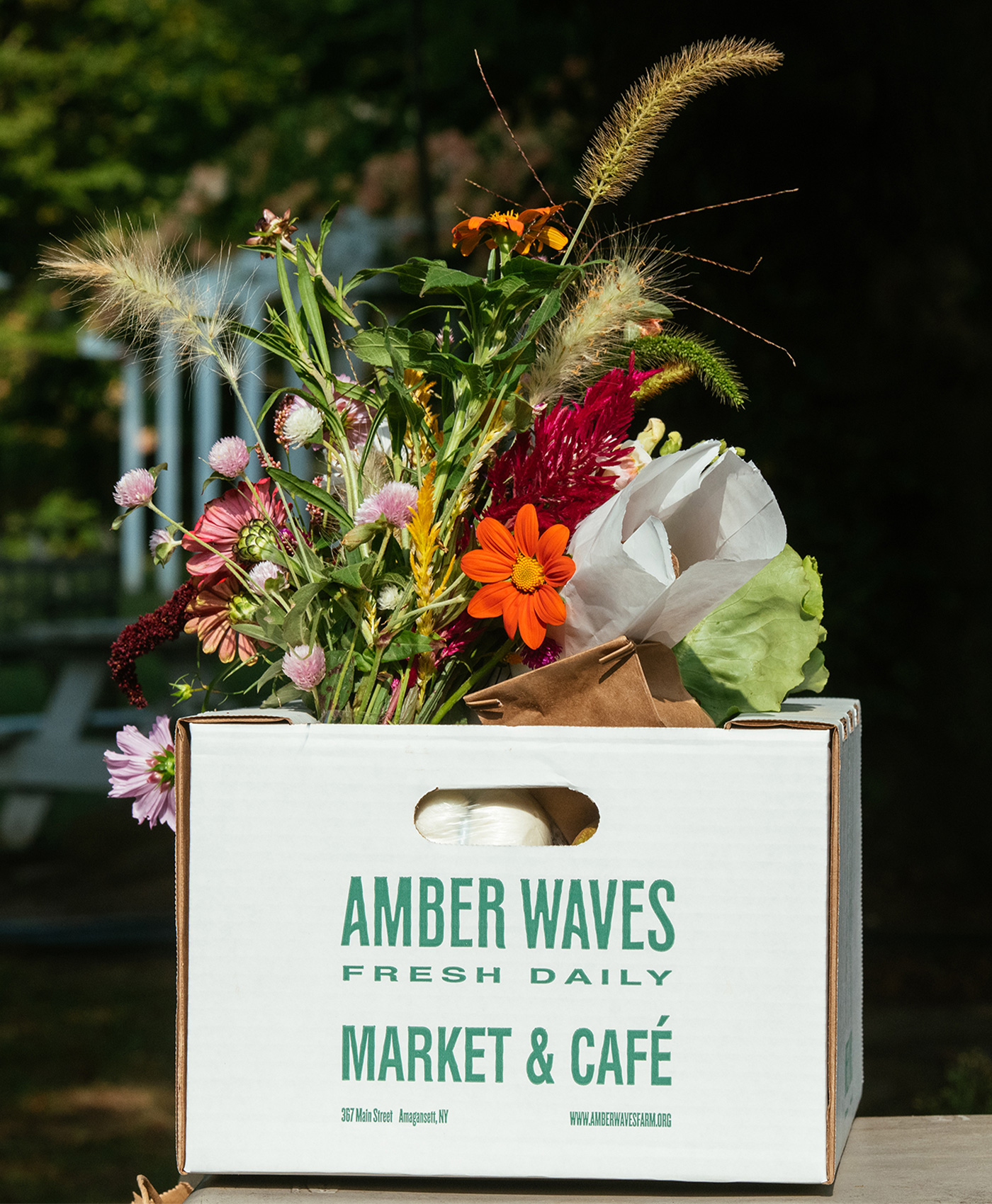
The flexibility of the brand is seen in the typography. Through the use of 4 typefaces from the Knockout type family by Hoefler&Co, there are hundreds of combinations to keep packaging, printed collateral, posters, and social posts playful, fun, and unique.

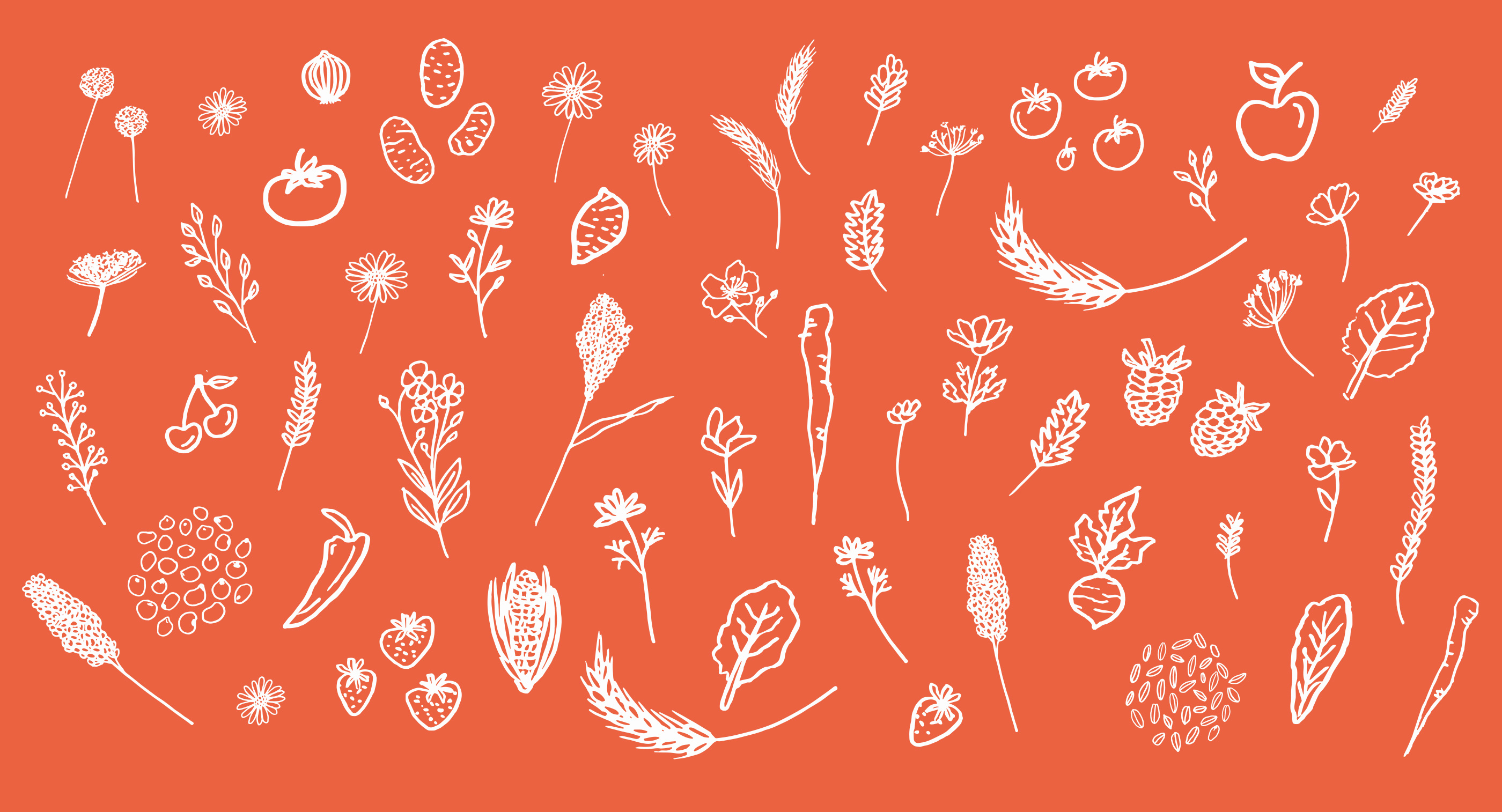

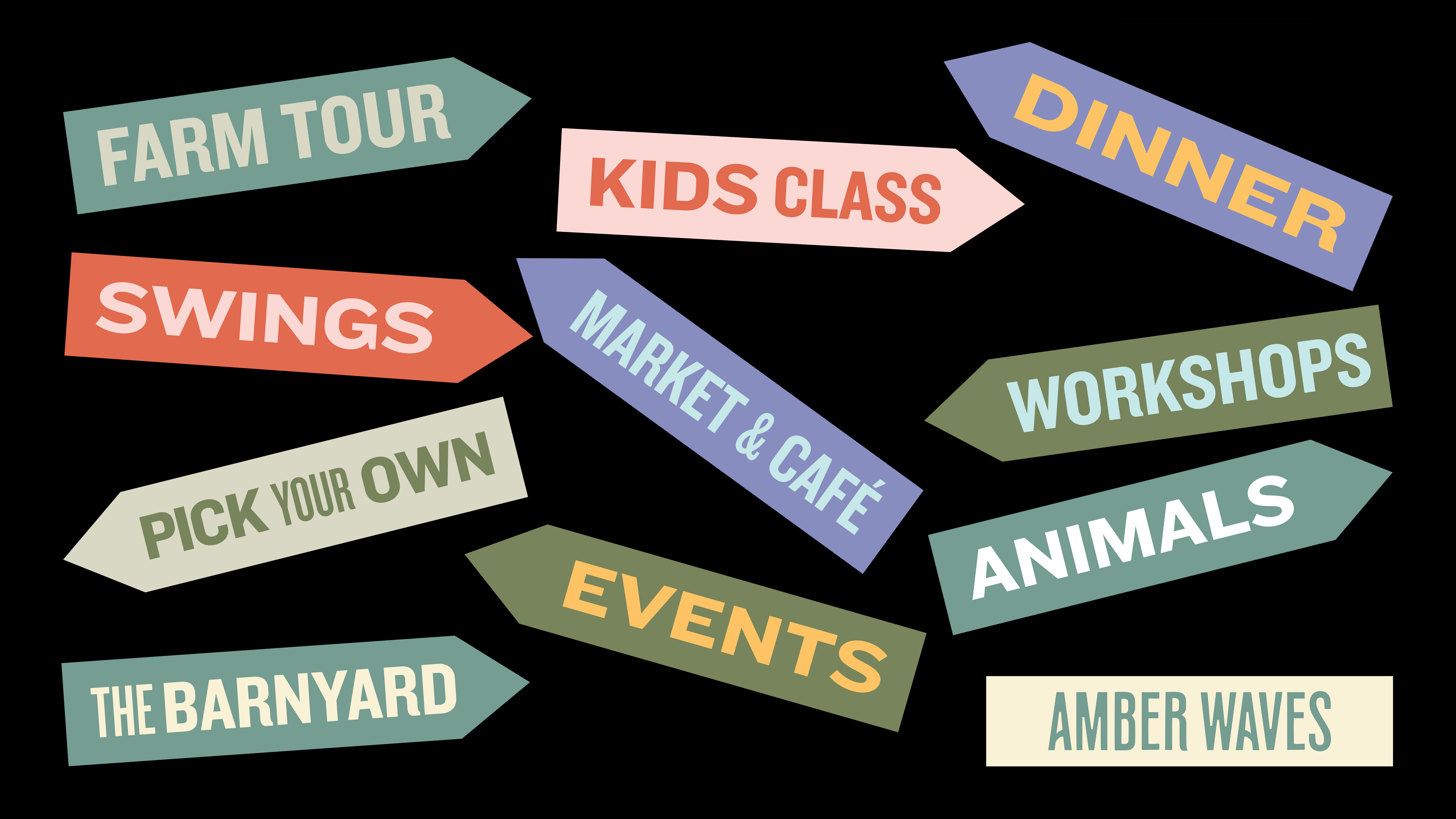
We took the playful color palette and typography style from our brand guidelines to design the new market sign and property signage guiding visitors throughout the property.