Kahilla
As The Nook Online’s founders prepared to scale their business model, we developed an identity to align with their company’s new name: Kahilla, which refers to a group of people united by a common goal. Starting with branding and extending into design, communications strategy, and messaging across all collateral—including Kahilla’s website—we articulated the company’s commitment to empowerment and inclusivity.
Role: Lead Designer
Studio: MA’AM
Creative Director: Sharon Taylor
Managing Director: Kristina Unker

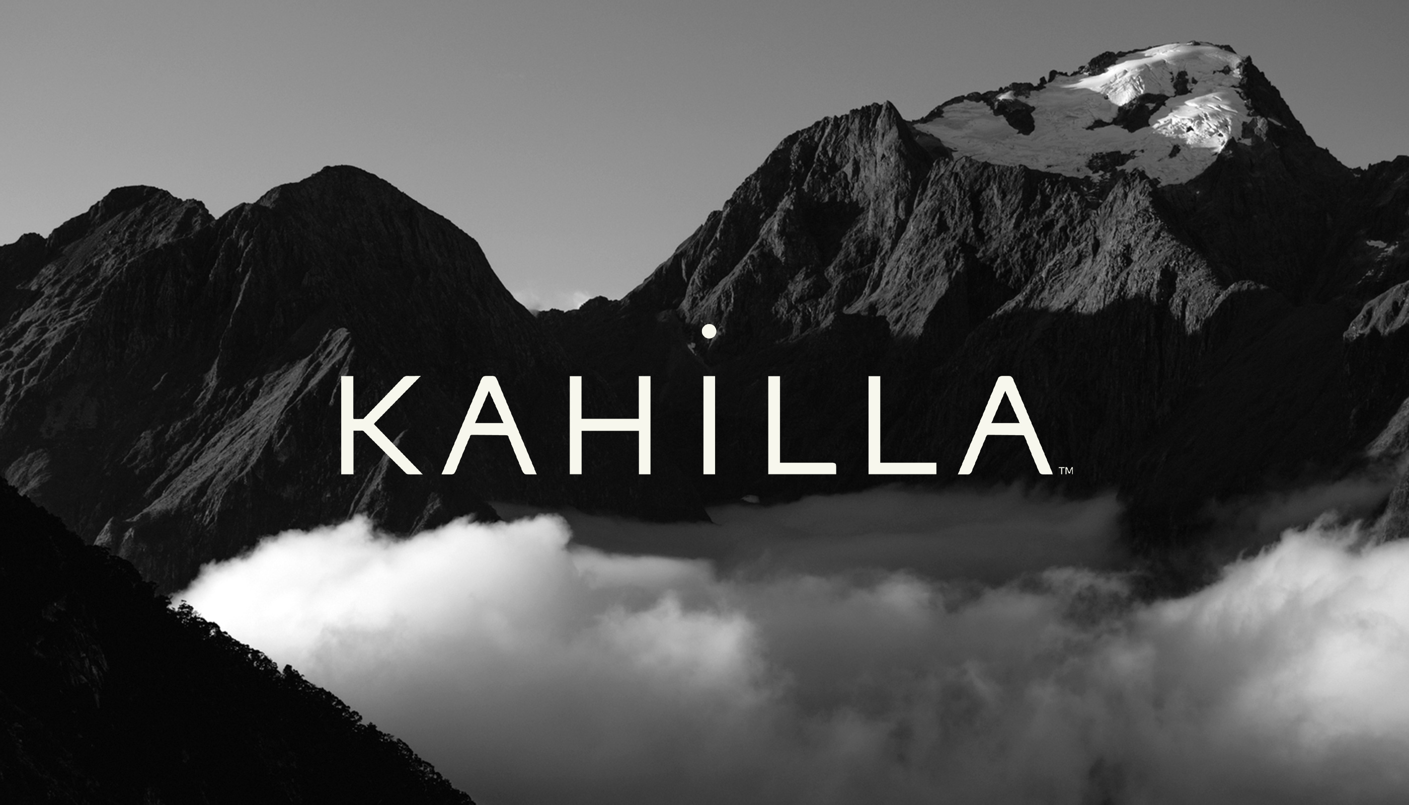
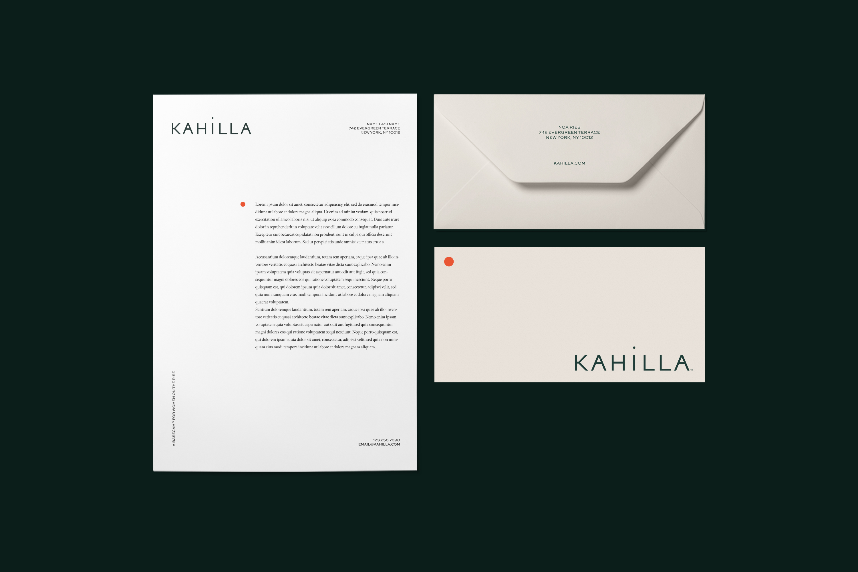
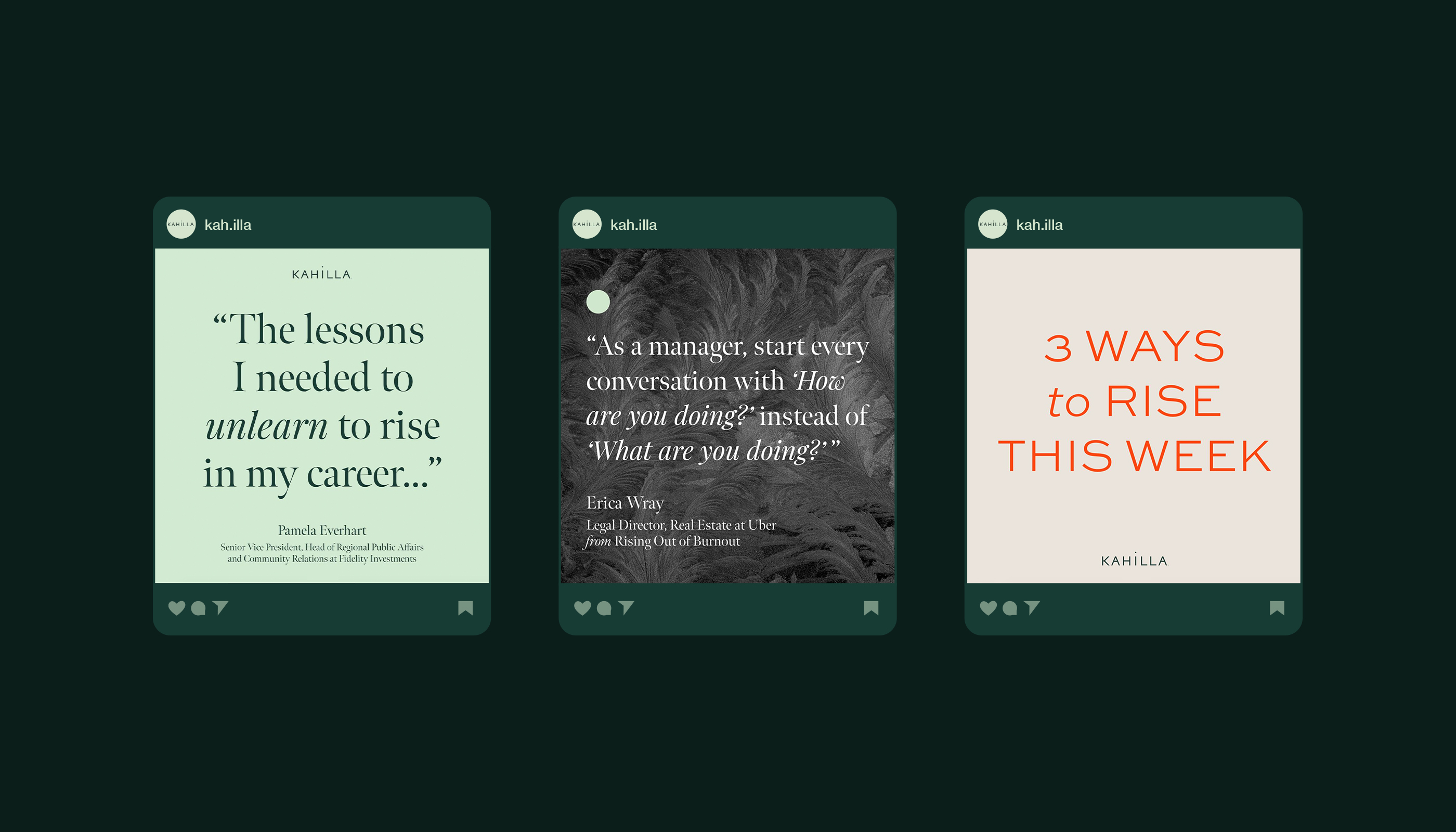
The Kahilla logo embodies community. Its solid, block letterforms infuse the wordmark with a strong and balanced foundation, while the elevation of its members is signified by the dot of the “i” rising above its base. Together, these elements express Kahilla’s identity as a “basecamp for women on the rise.”
The tagline is stacked and placed on the right side of the logo, with a vertical line mimicking a flag.
The brand icon (a circle) symbolizes the Kahilla basecamp and serves as a visual distinguisher, leading viewers on a webpage, highlighting headlines, and adorning foundational brand collateral.


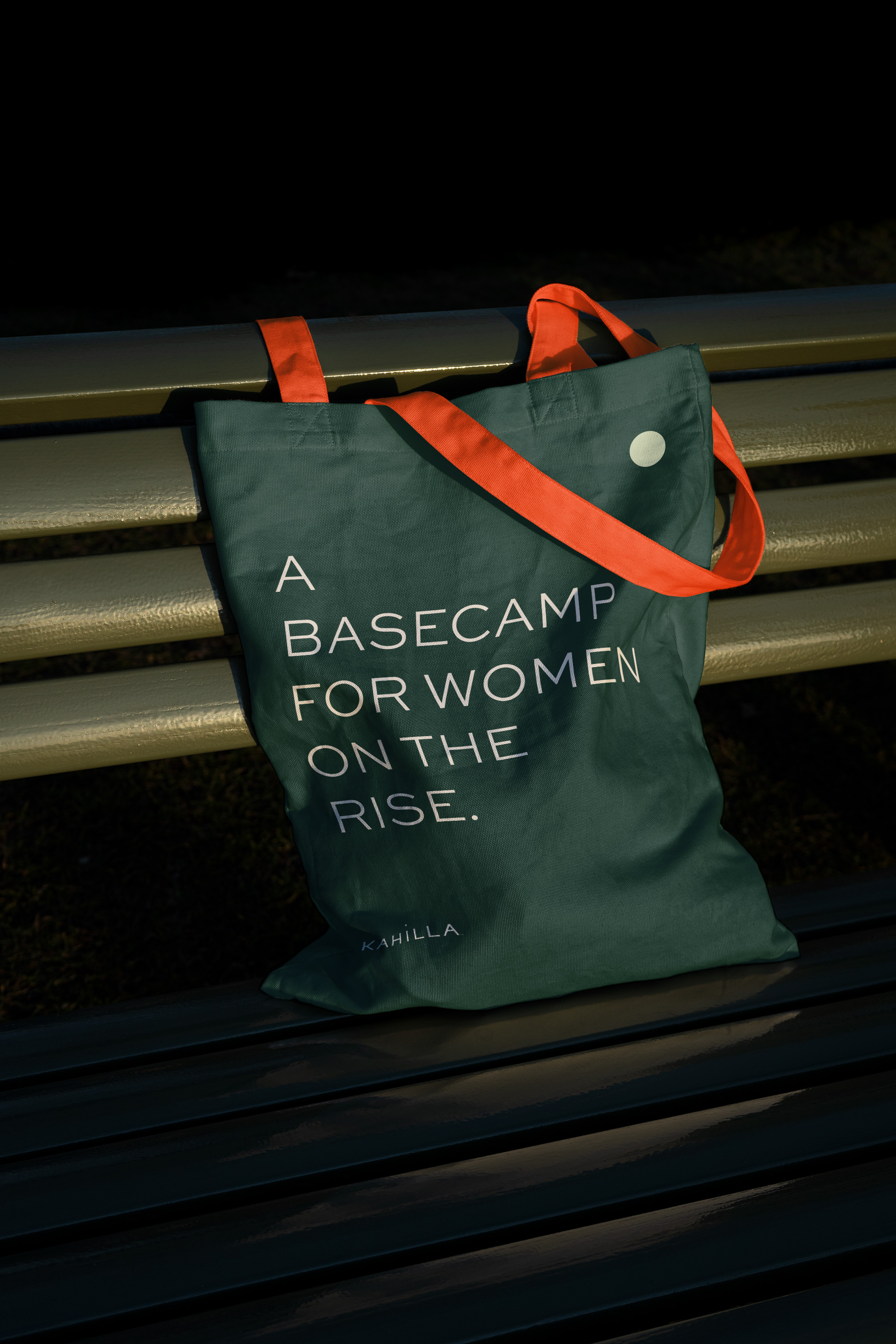
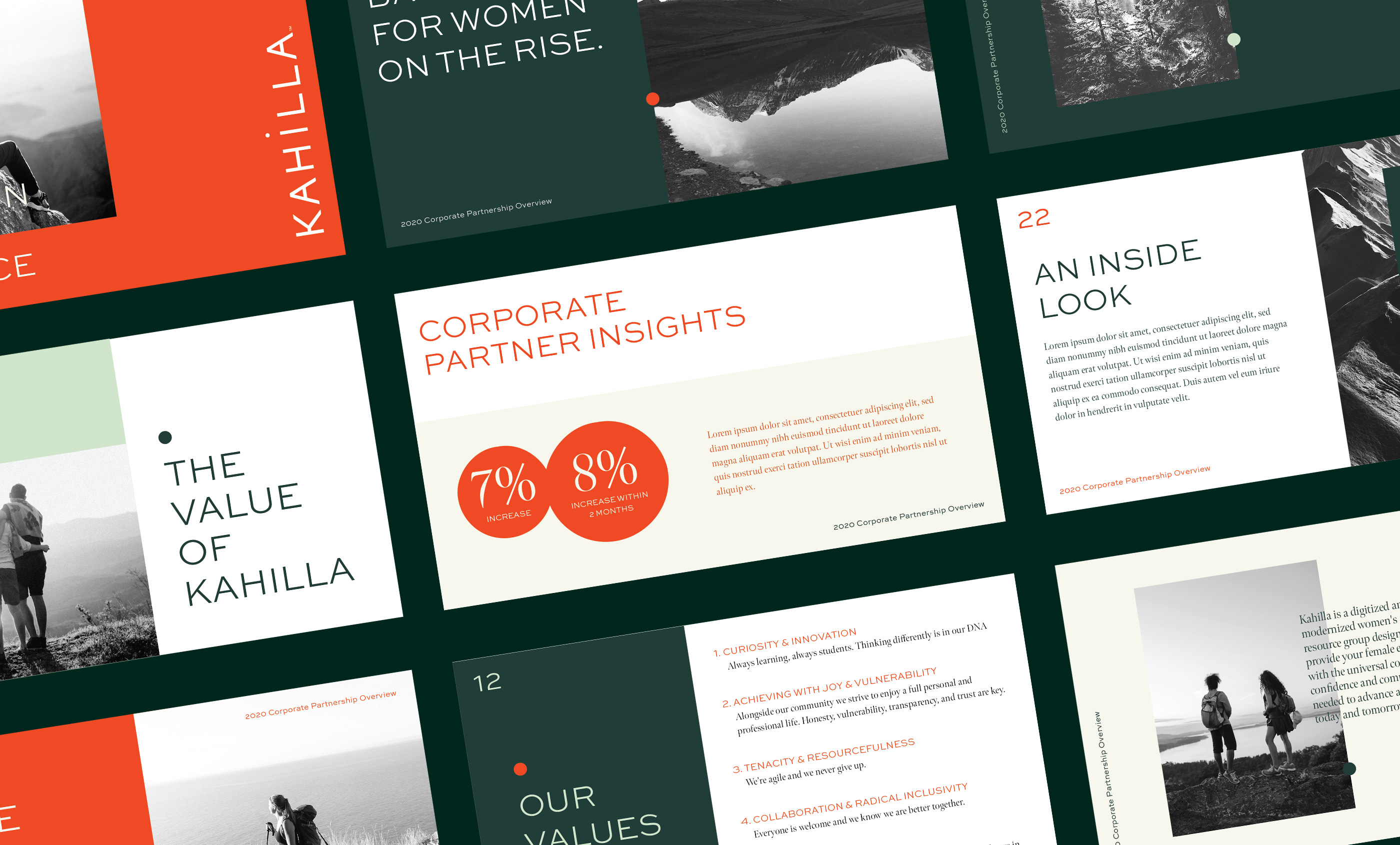


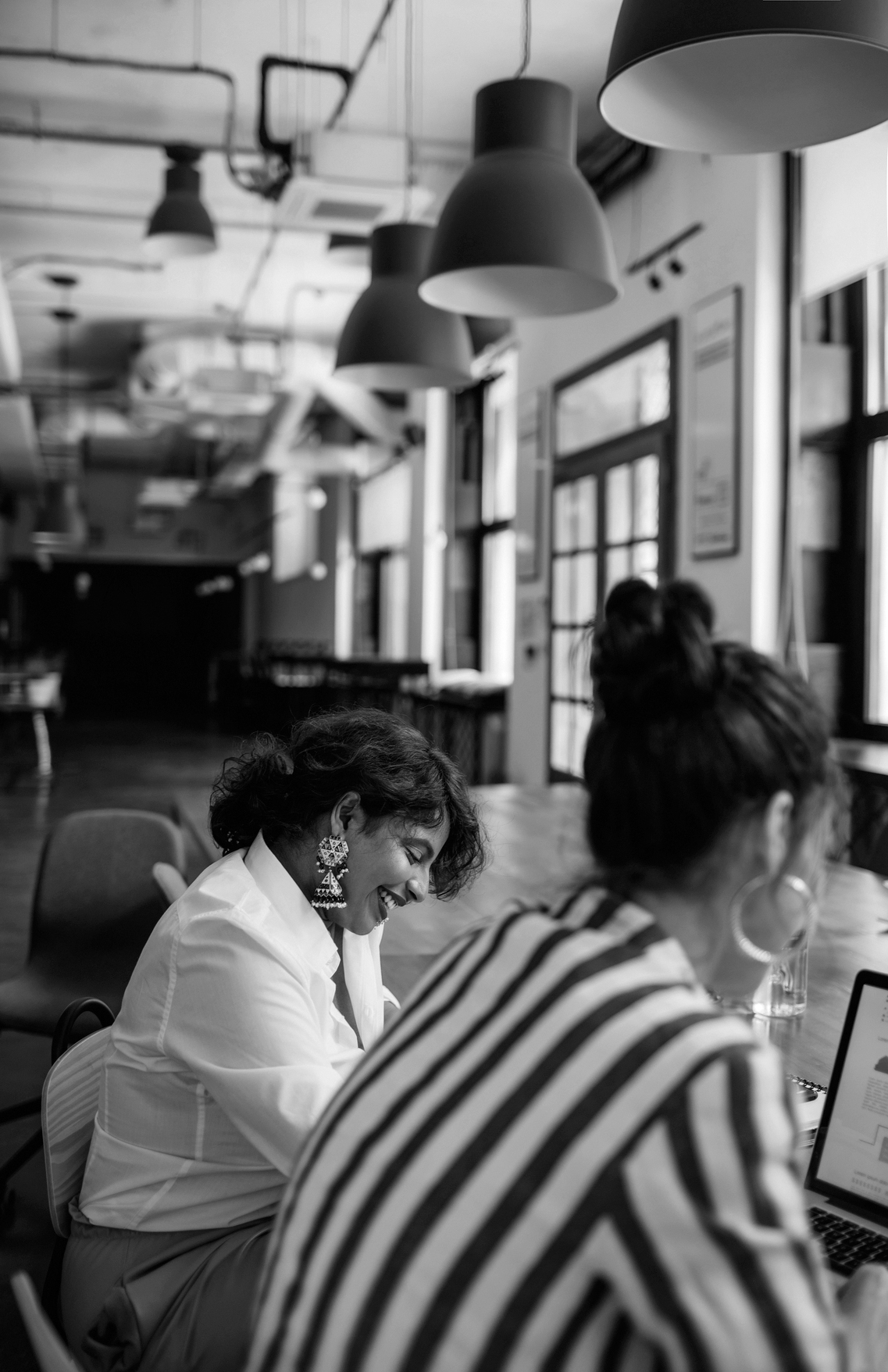

The photography direction reflects the feeling of community and nature through energetic and bold black and white photography.