The Hub: F&B
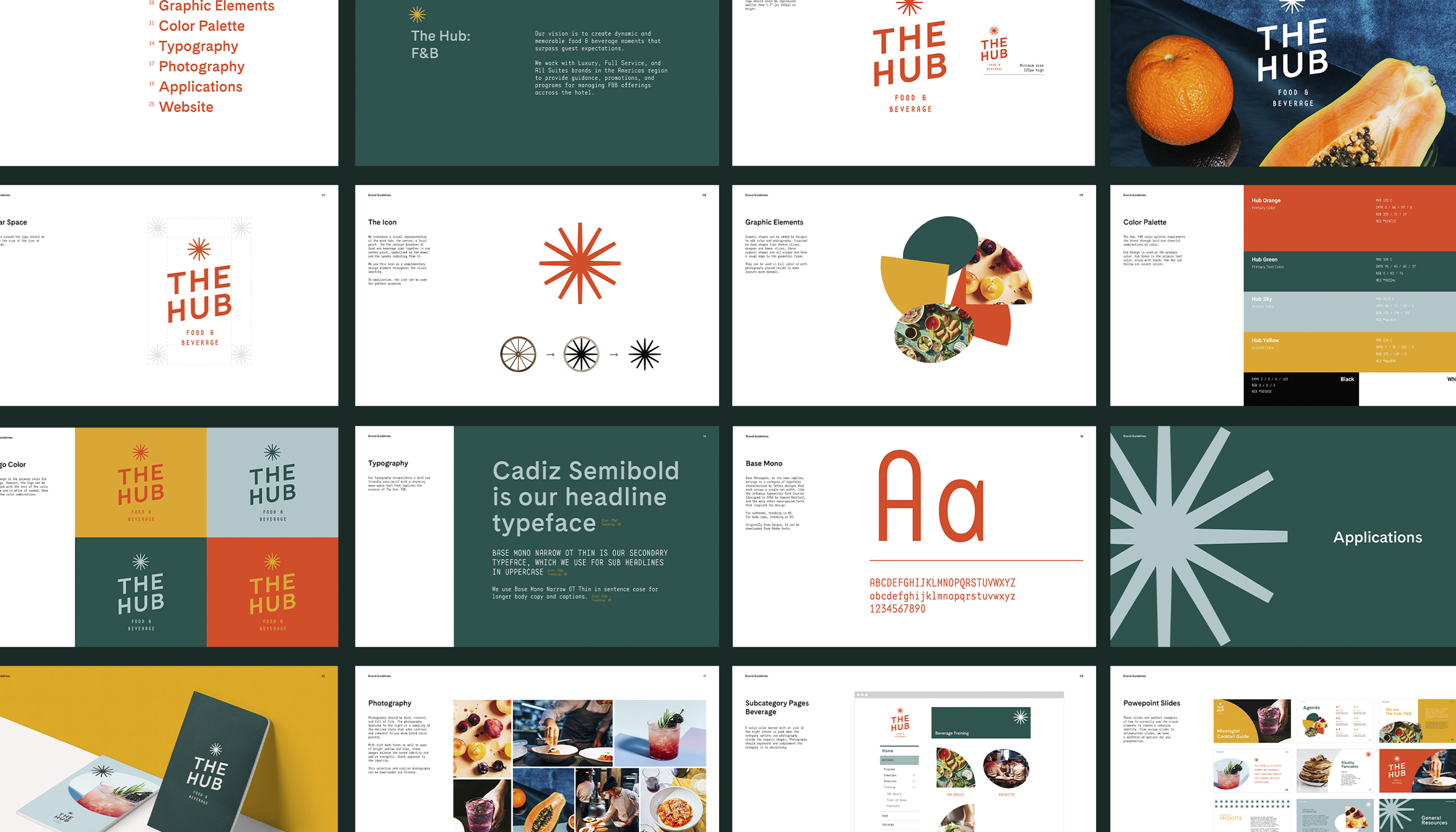
We partnered with Hilton to update the name and brand identity of the company’s North America Food & Beverage (F&B) group, with the goal of elevating its positioning and celebrating its diverse portfolio. The Hub succinctly captures the value and features of the group: It is a central location where tools, resources, and expertise are shared amongst F&B team members and external partners.
Role: Lead Designer
Studio: MA’AM
Creative Director: Sharon Taylor
Managing Director: Kristina Unker
Copywriting: Christina Clark
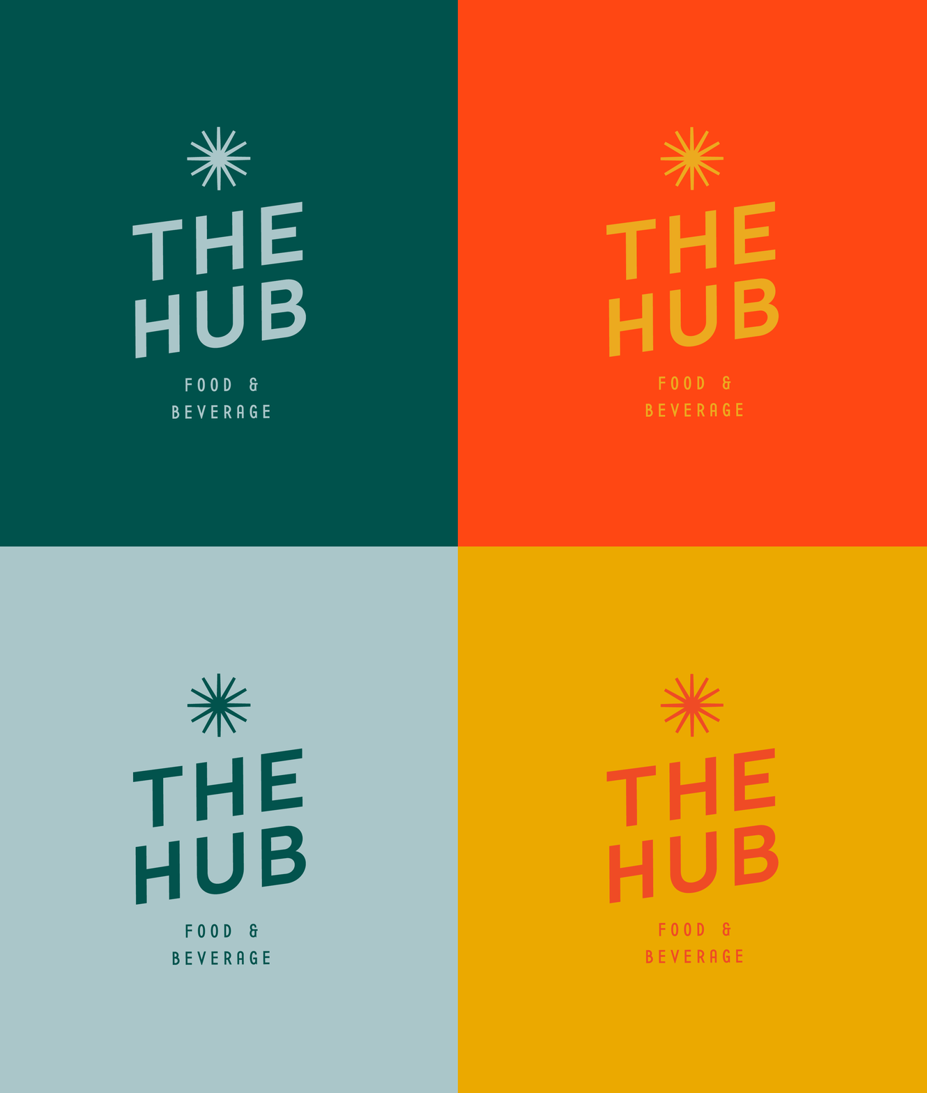
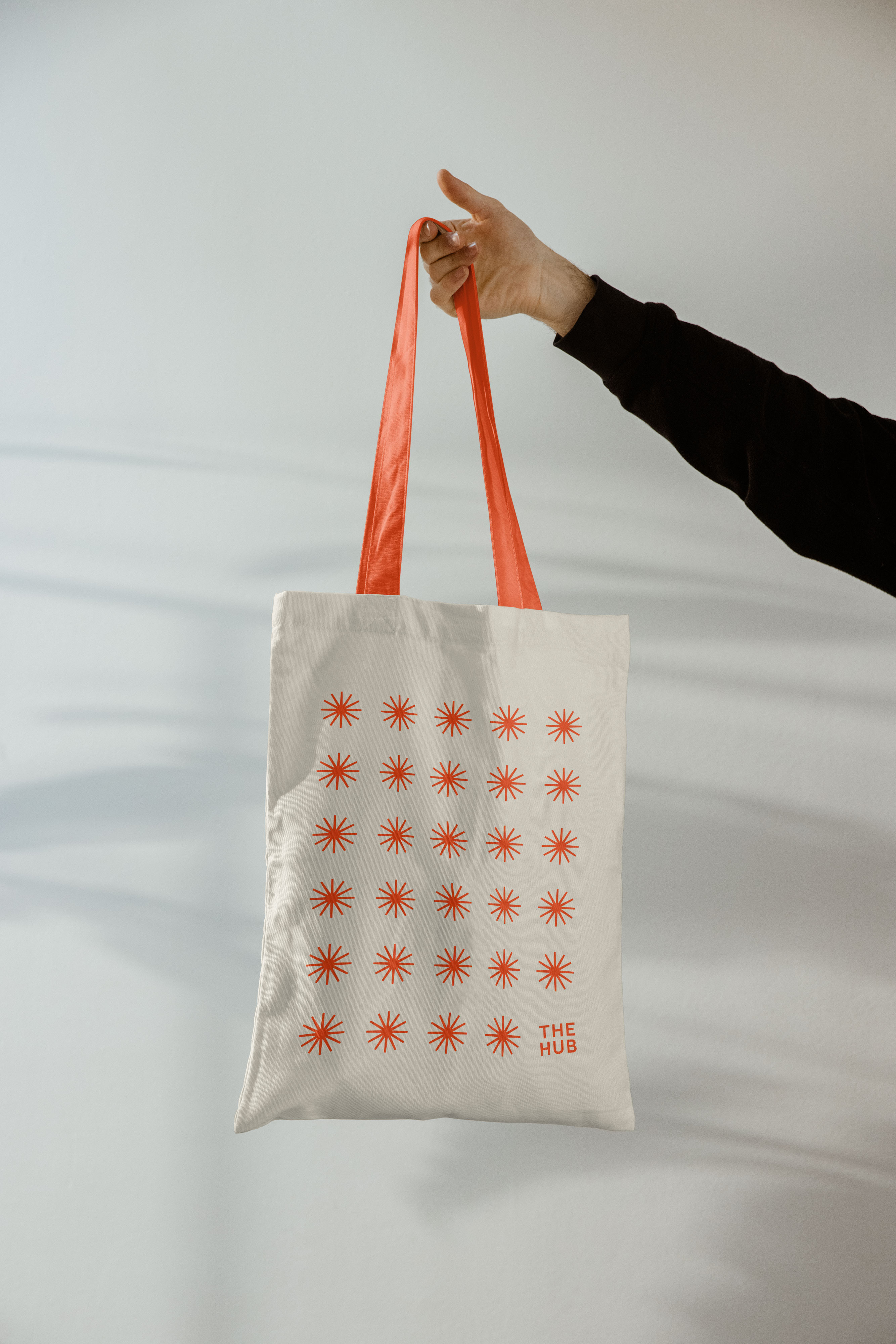
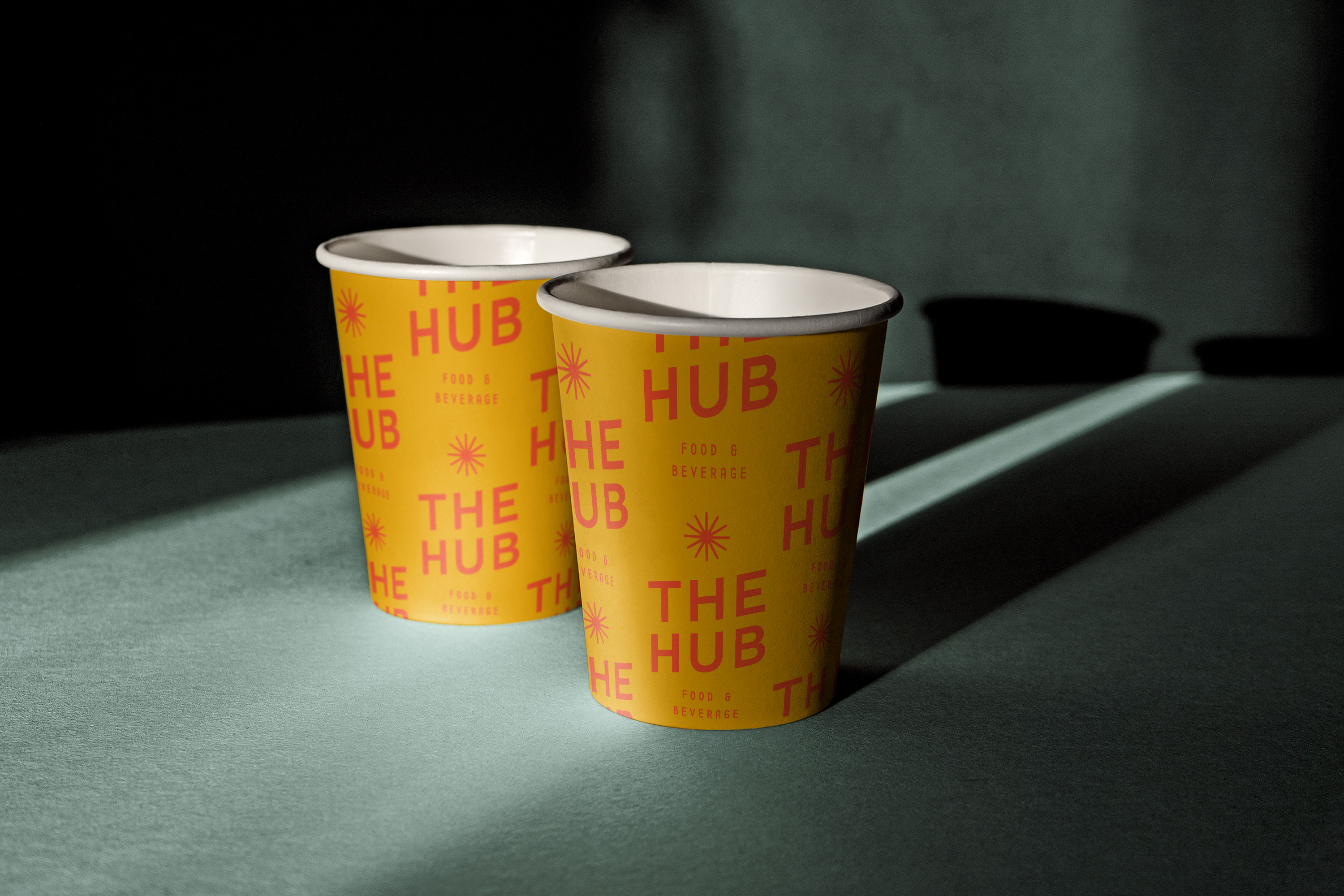
The brand’s symbol, a visual representation of the word “hub” or “focal point,” features the various F&B branches meeting at one central point.
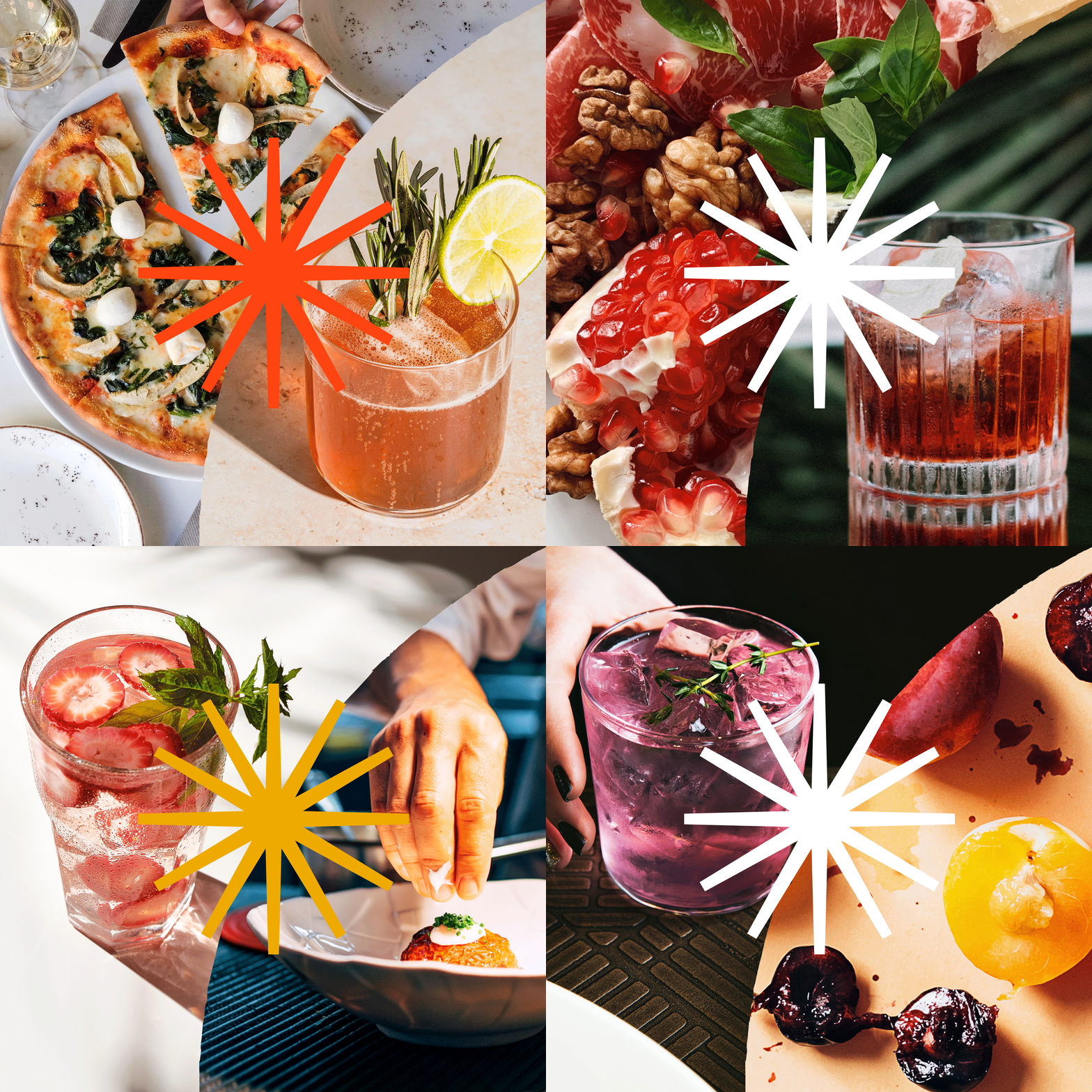
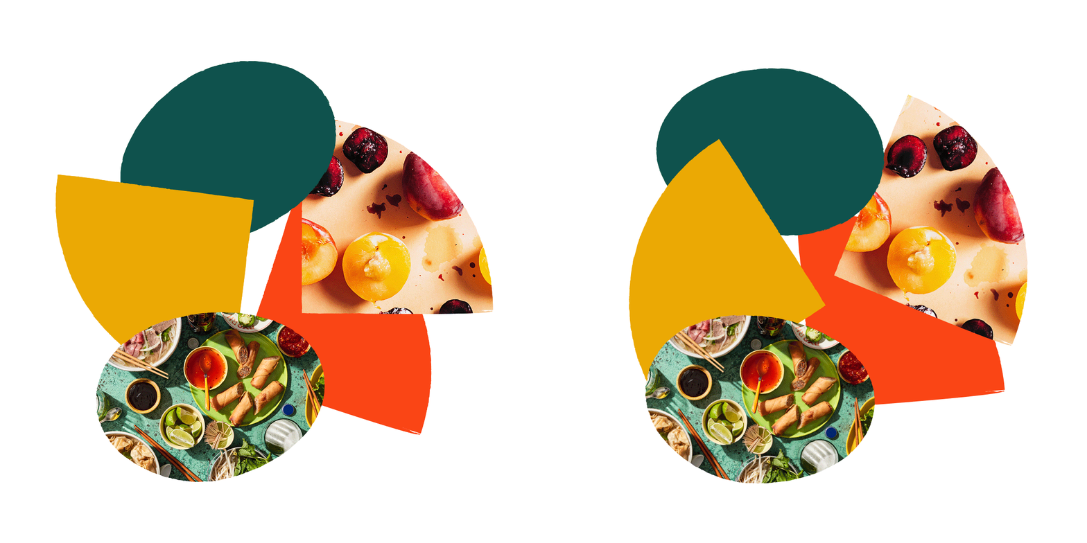
In addition, we created graphic elements with rough edges inspired by different food shapes. We then used them to showcase the intersection of food and beverage throughout the applications.



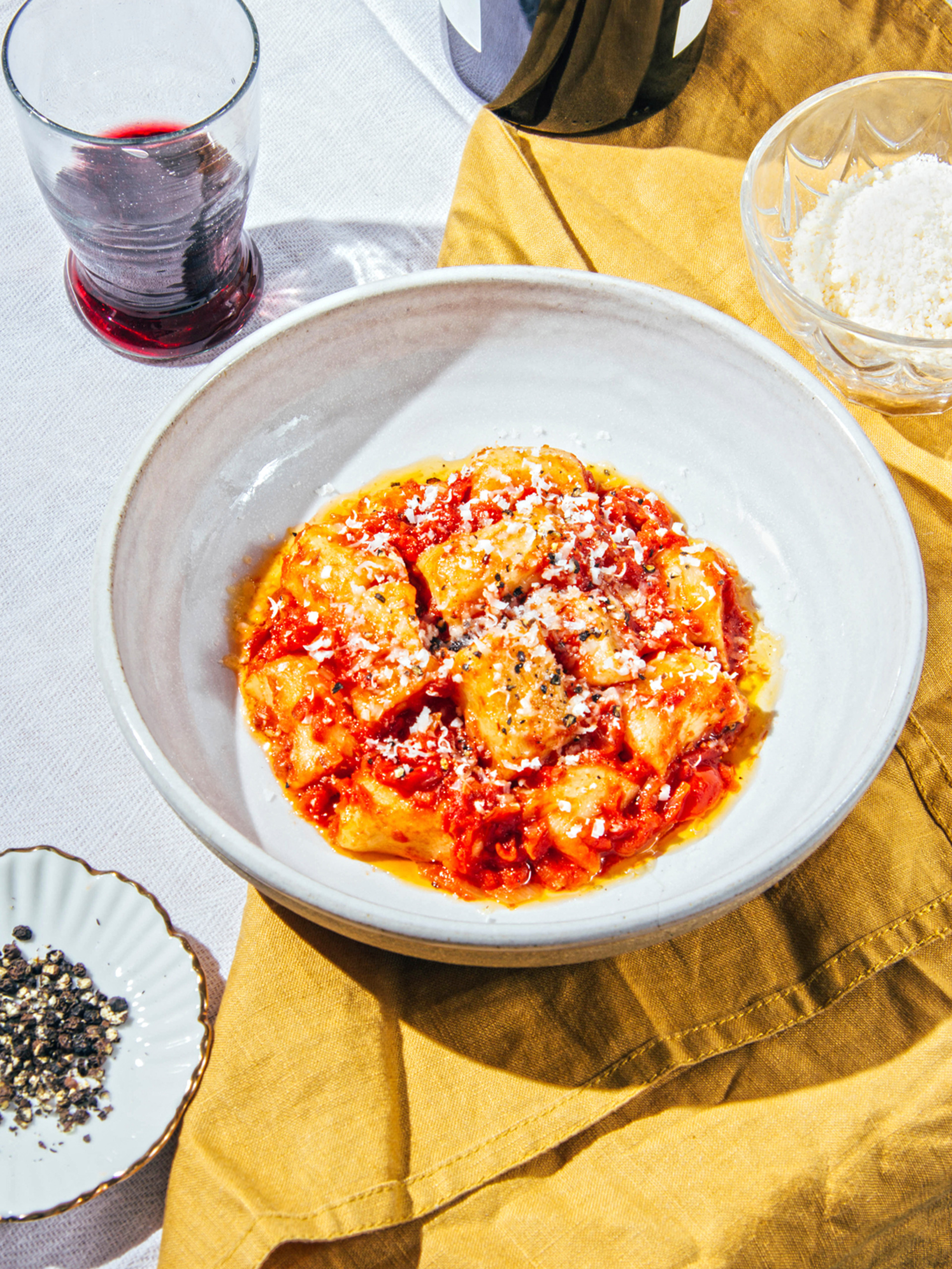
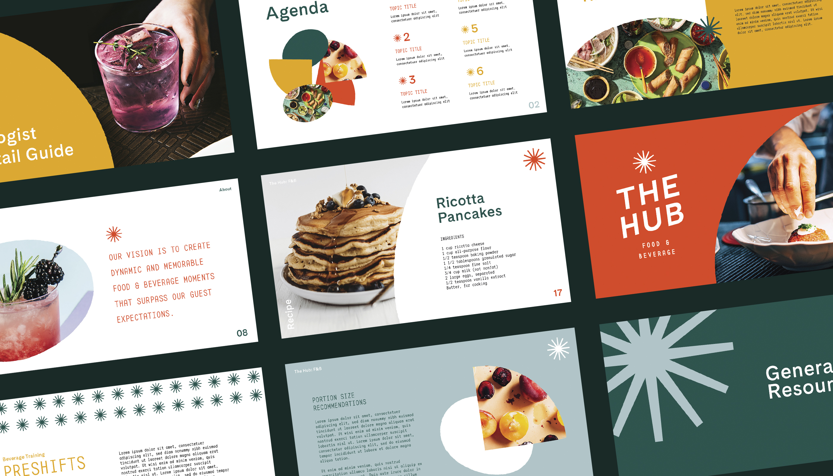
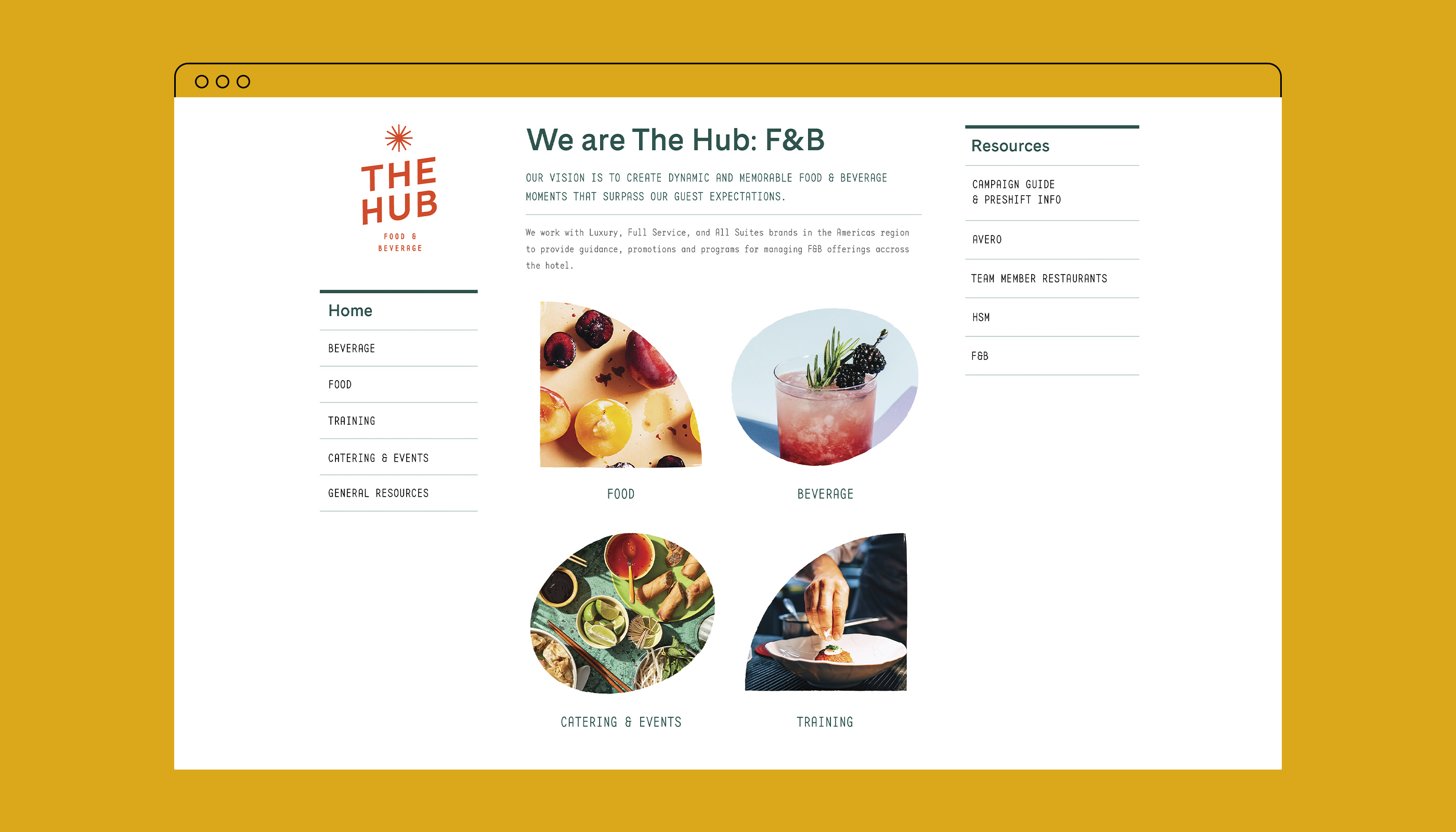
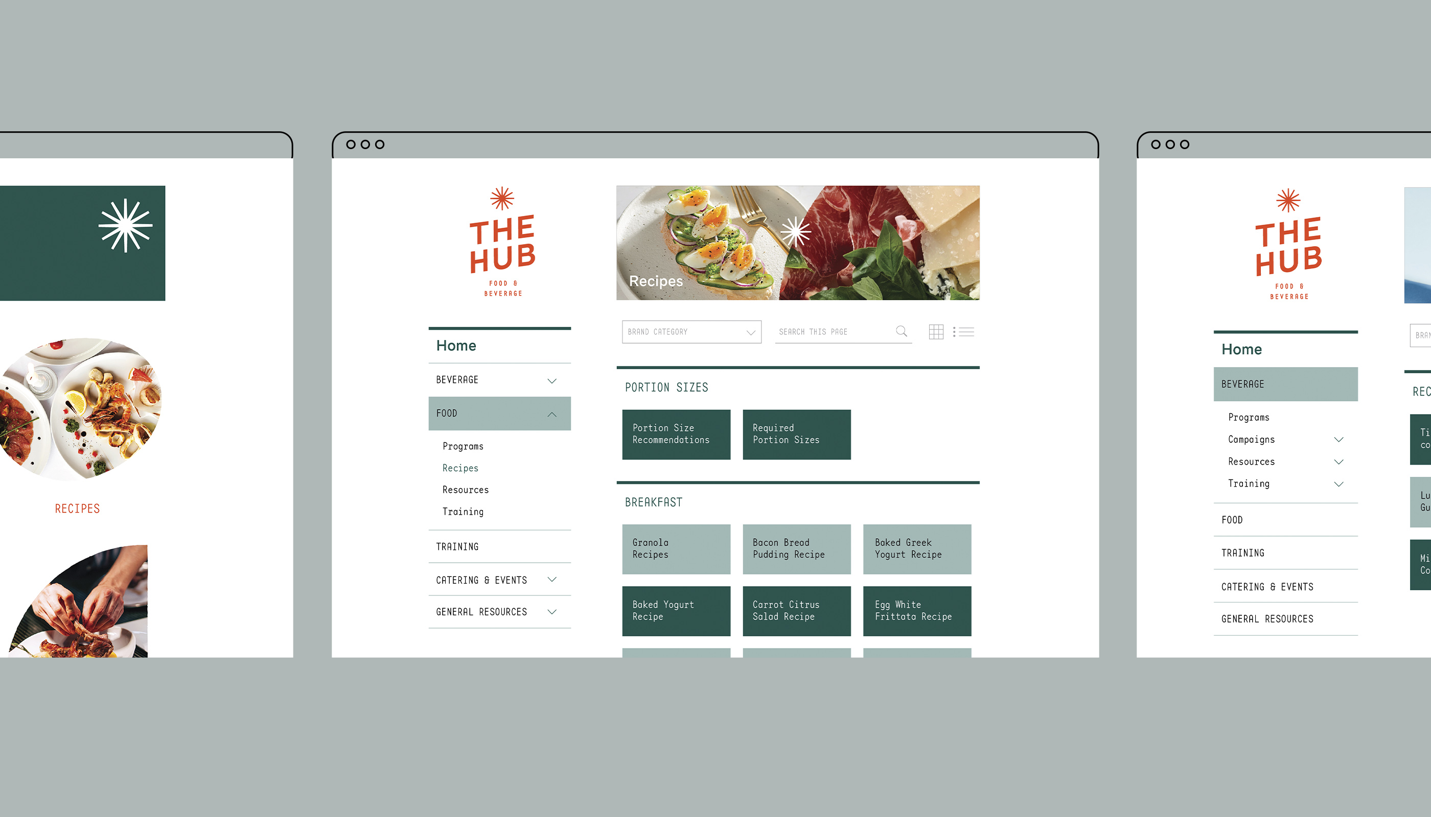
Working within the constraints of a pre-developed template, we also evolved the design of The Hub’s internal sharing platform, using new typography and imagery applications to augment its energy and dynamism.

We gathered all assets into a comprehensive brand guideline, to be used across all food and beverage internal applications.
