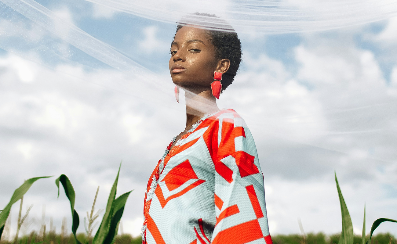
Sitka Aesthetics
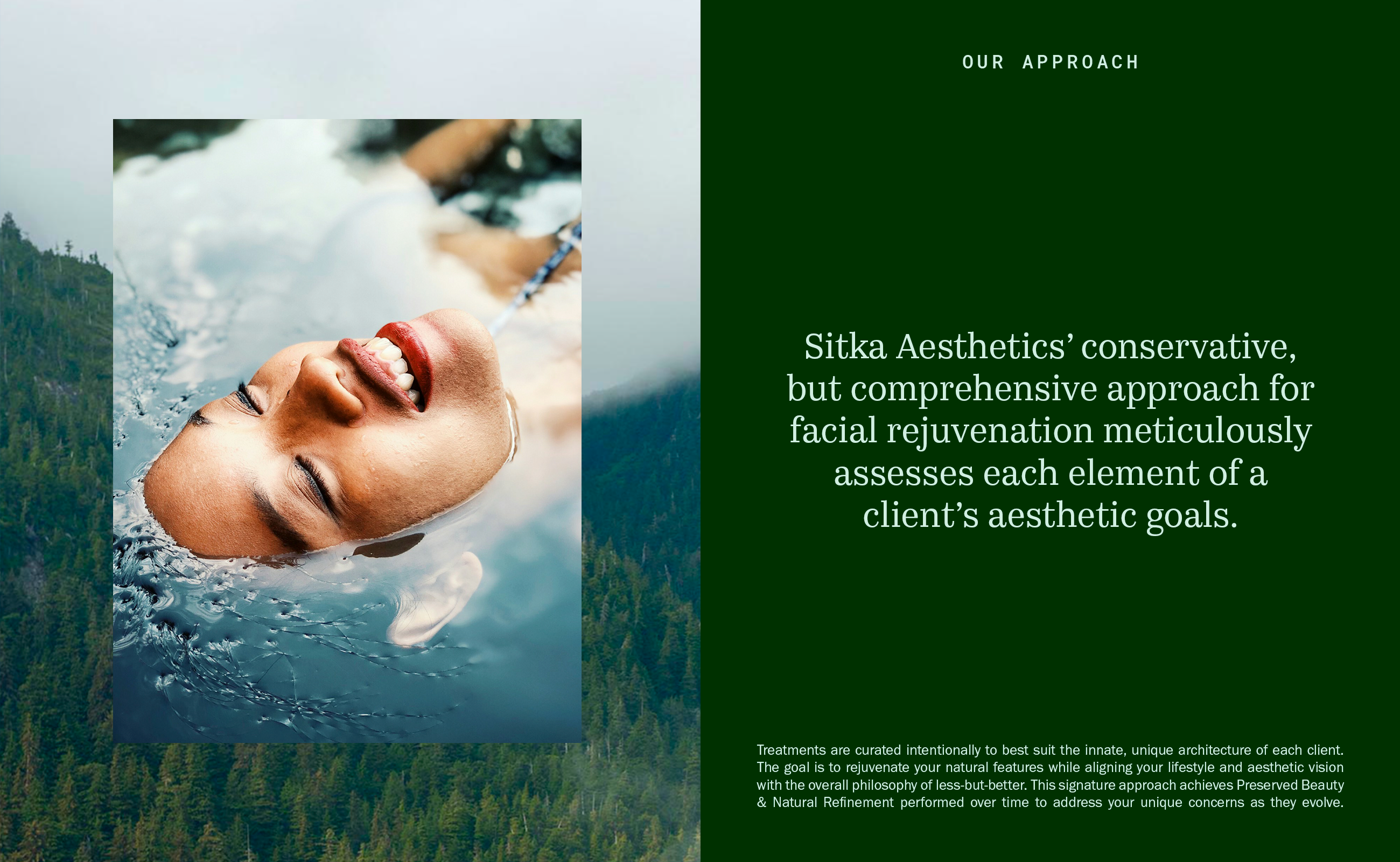
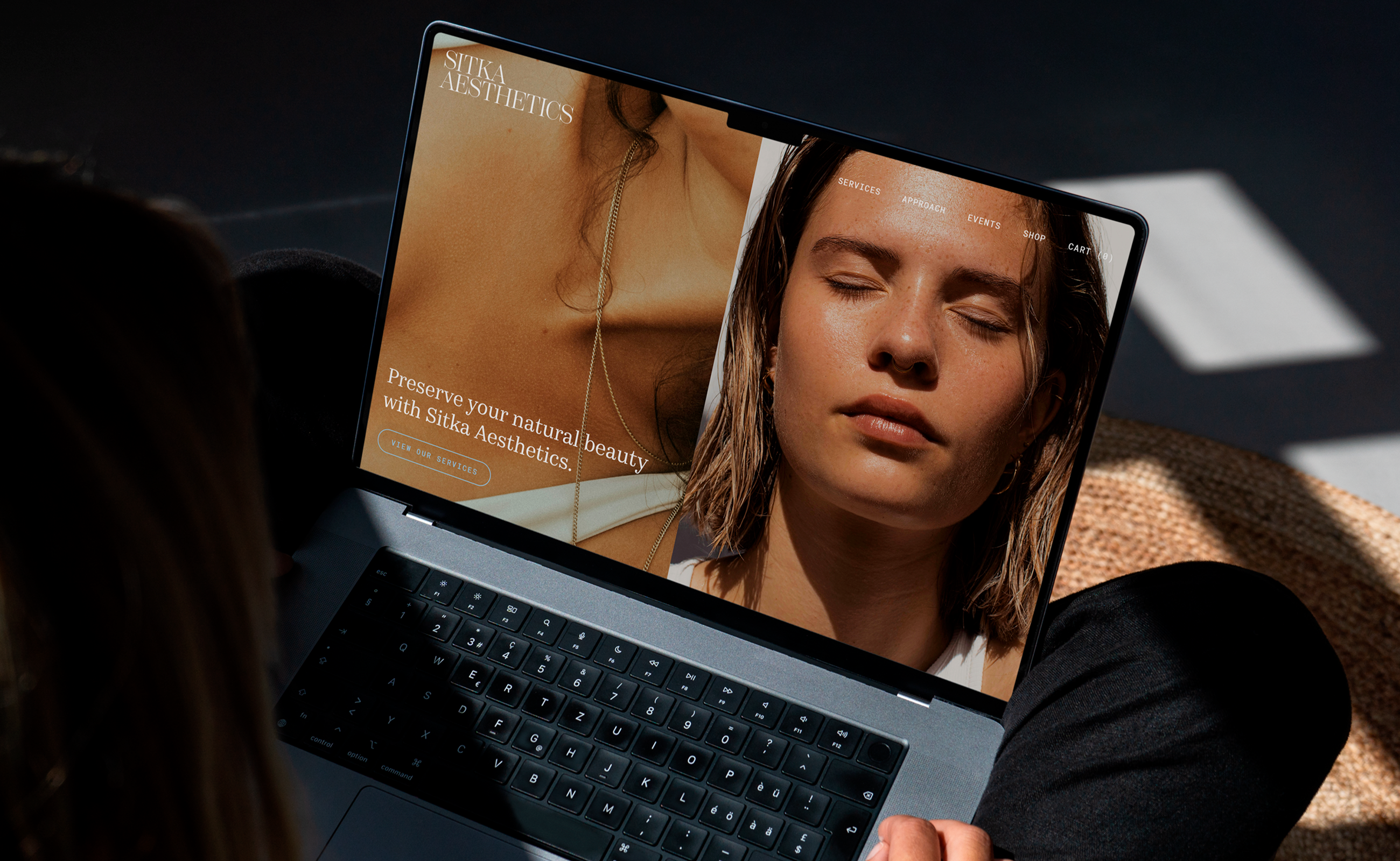
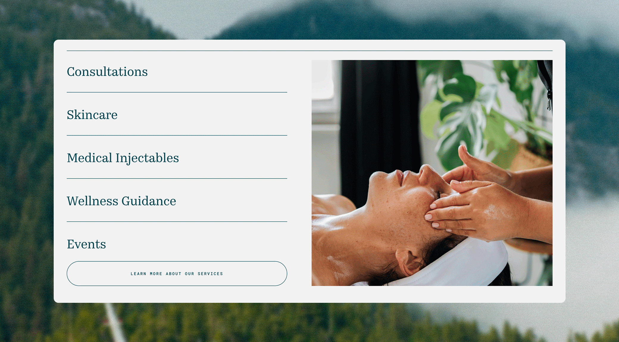
Sitka Aesthetics is a med spa in Sitka, Alaska providing a conservative but comprehensive approach to facial rejuvenation, meticulously assessing each element of a client’s aesthetic goals. With their philosophy of less is more, Sitka Aesthetics aims to rejuvenate the natural features of each client while aligning with their lifestyle and aesthetic vision.
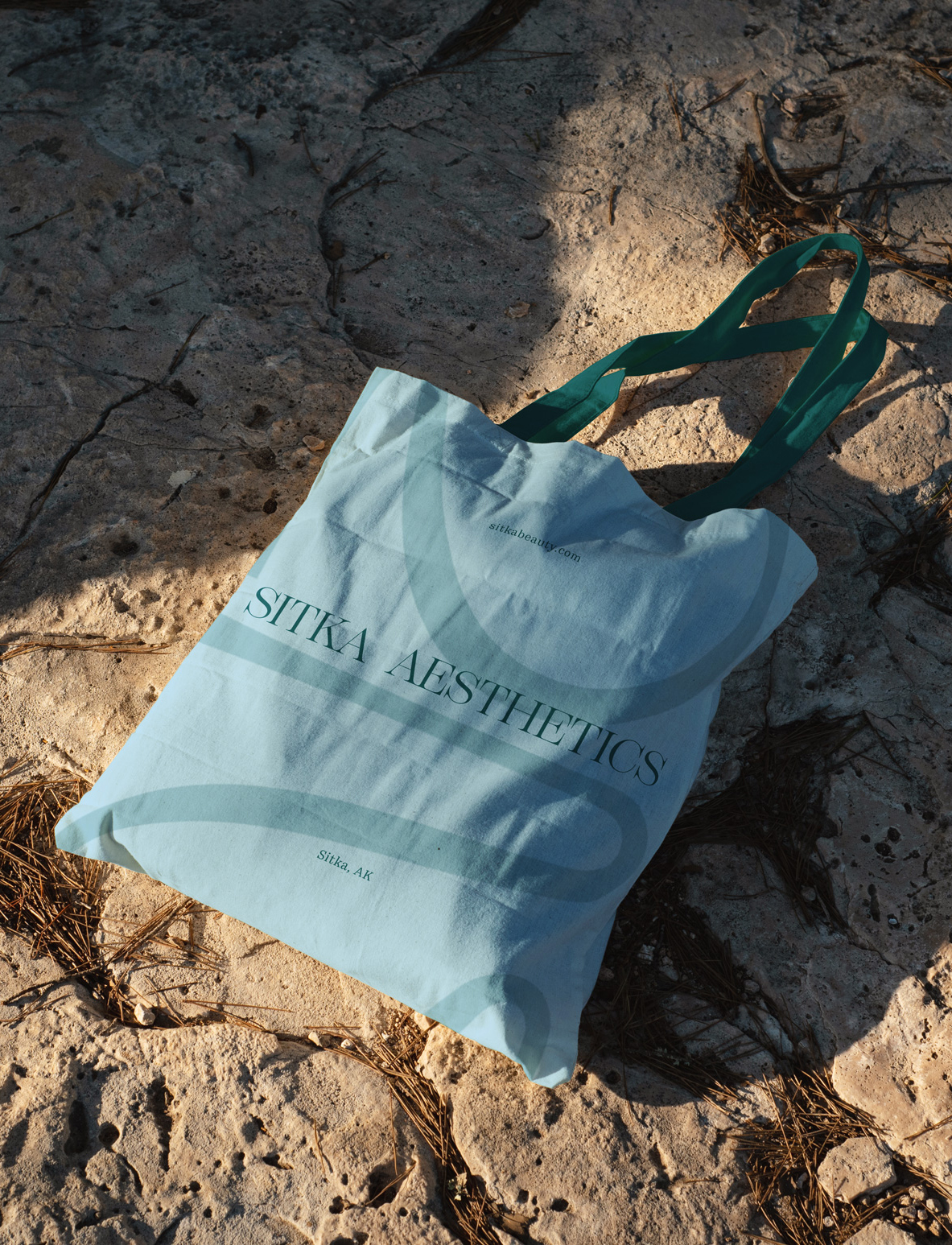
The visual identity takes characteristics from the town, mixing bold, airy, and symmetrical elements to create a balance between sophistication and playfulness. The logo uses a serif font that is elegant with refined details, while the monogram pays homage to Sitka’s roots with a harmonious and fluid shape.
Visit Sitka Aesthetic’s website︎︎︎
Role: Design and Creative Direction
Services: Visual Identity, Web Design, Art Direction
![]()
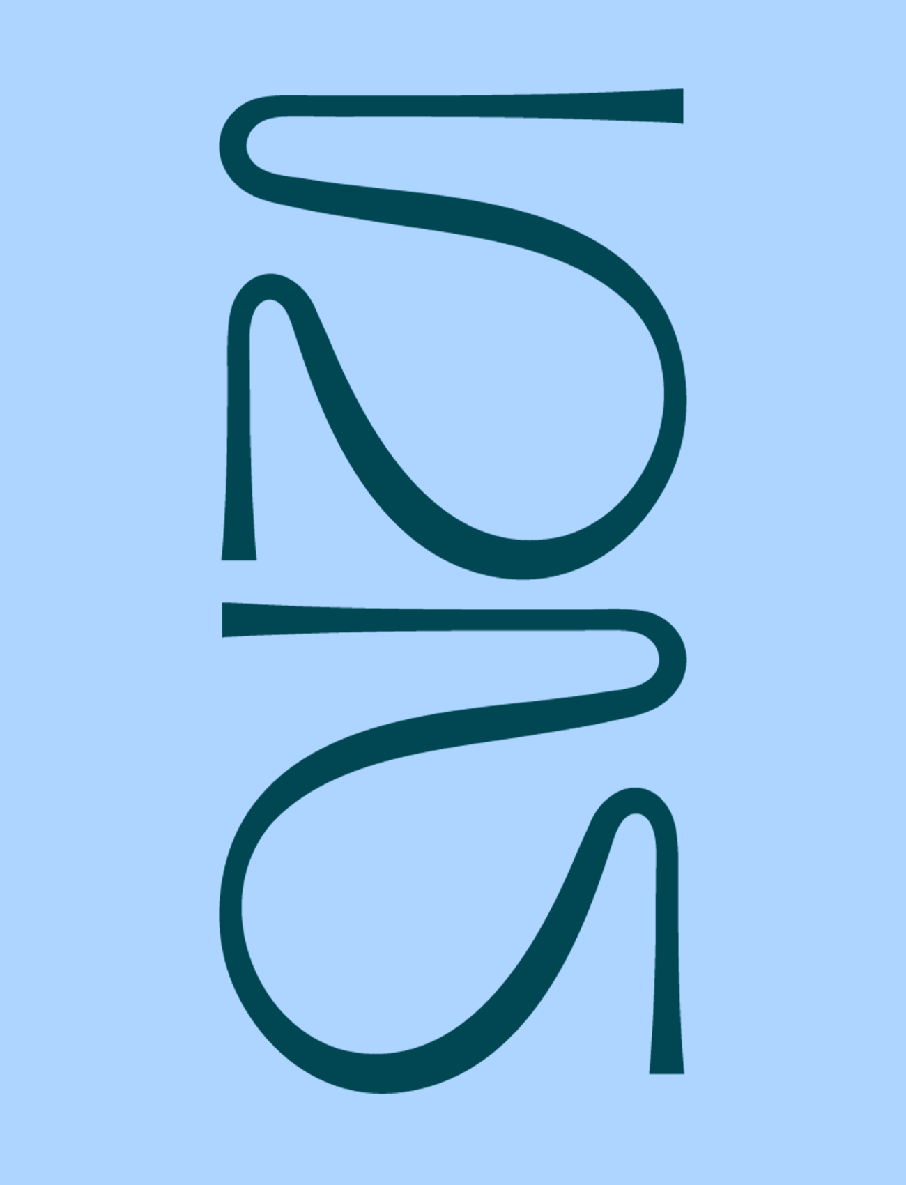
The monogram is inspired by the totem poles found in Sitka National Historical Park and nearby areas. The reflective characteristic found in most of the poles is used to create a connection between the S and A, which are mirror images of each other.

The typography also shows the balance between modern sophistication, using Kazimir Text, a structured serif font, paired with a clean and straightforward sans serif Franklin Gothic. Roboto Mono, a monospace font, is used throughout for accents and captions.
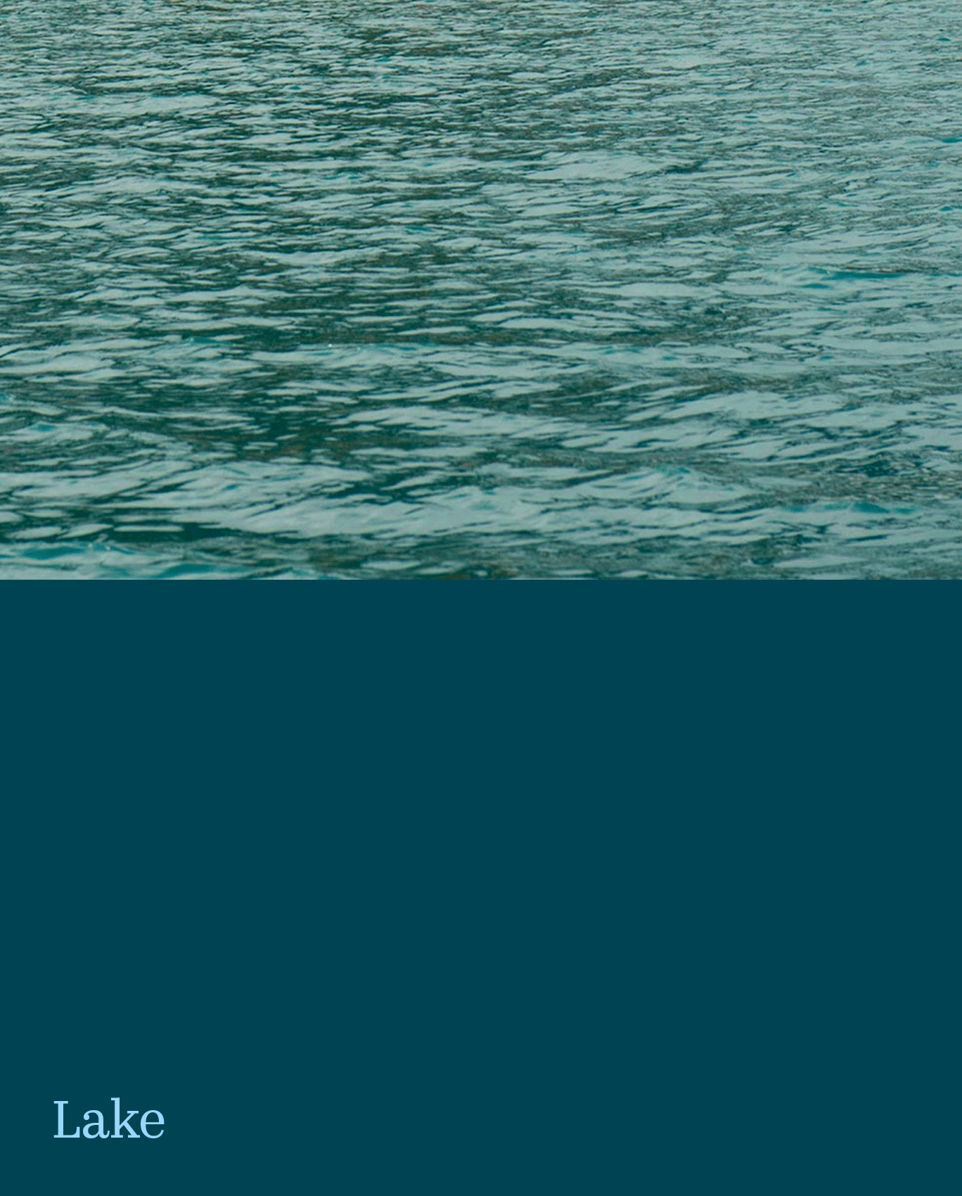
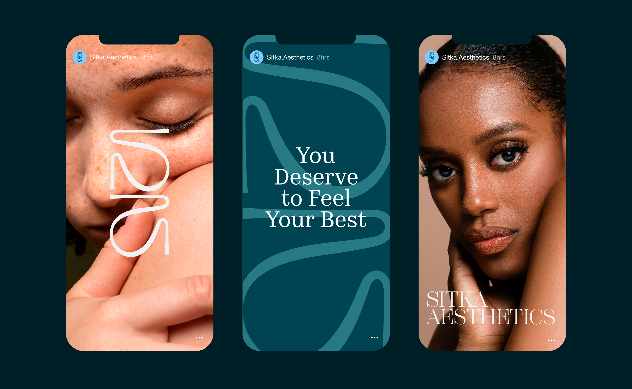
The color palette draws inspiration from the different tones found in Sitka. These colors are used in the ecommerce and social experience to complement and enhance the content presented, creating a visually engaging and cohesive experience.

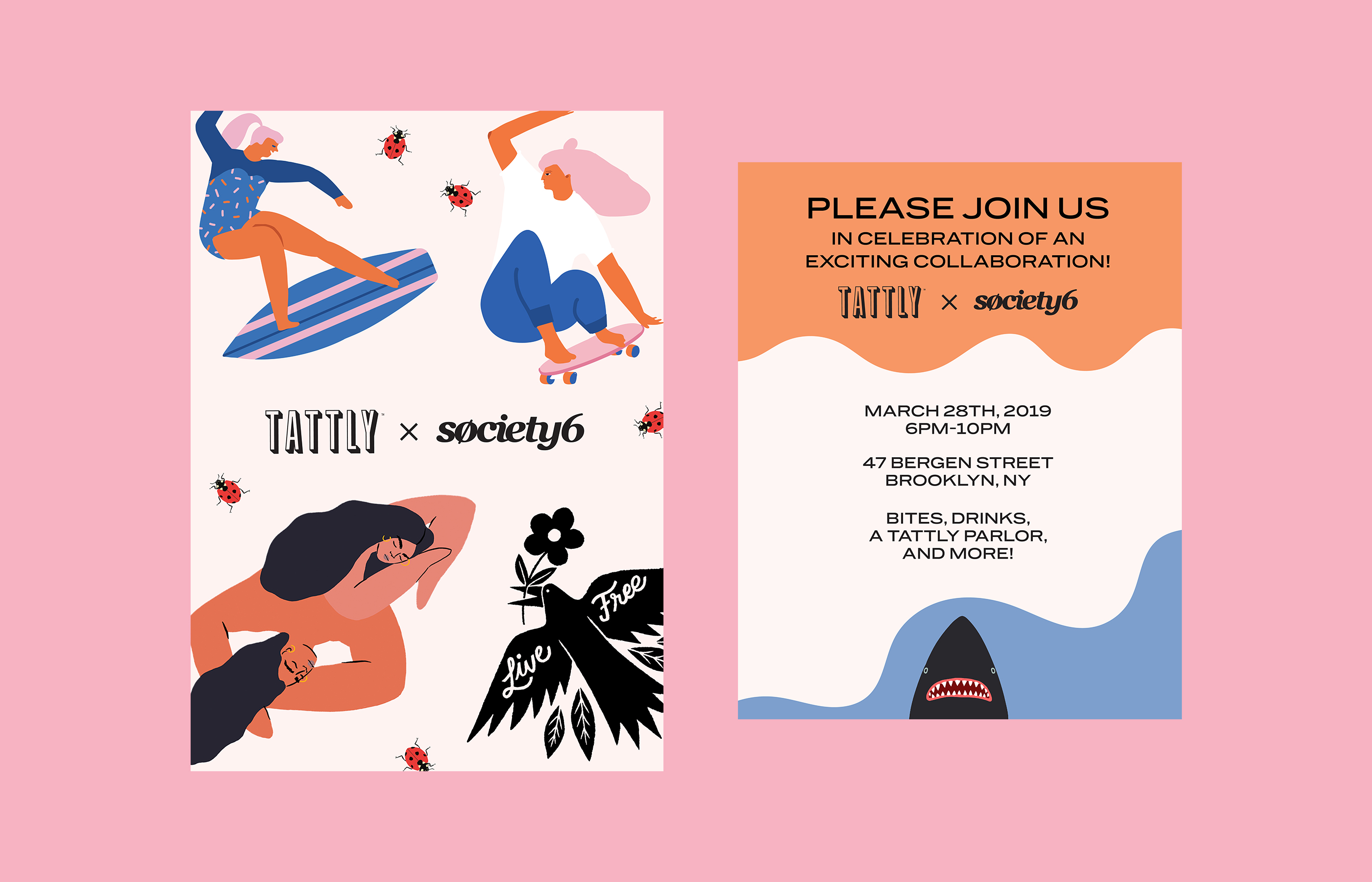
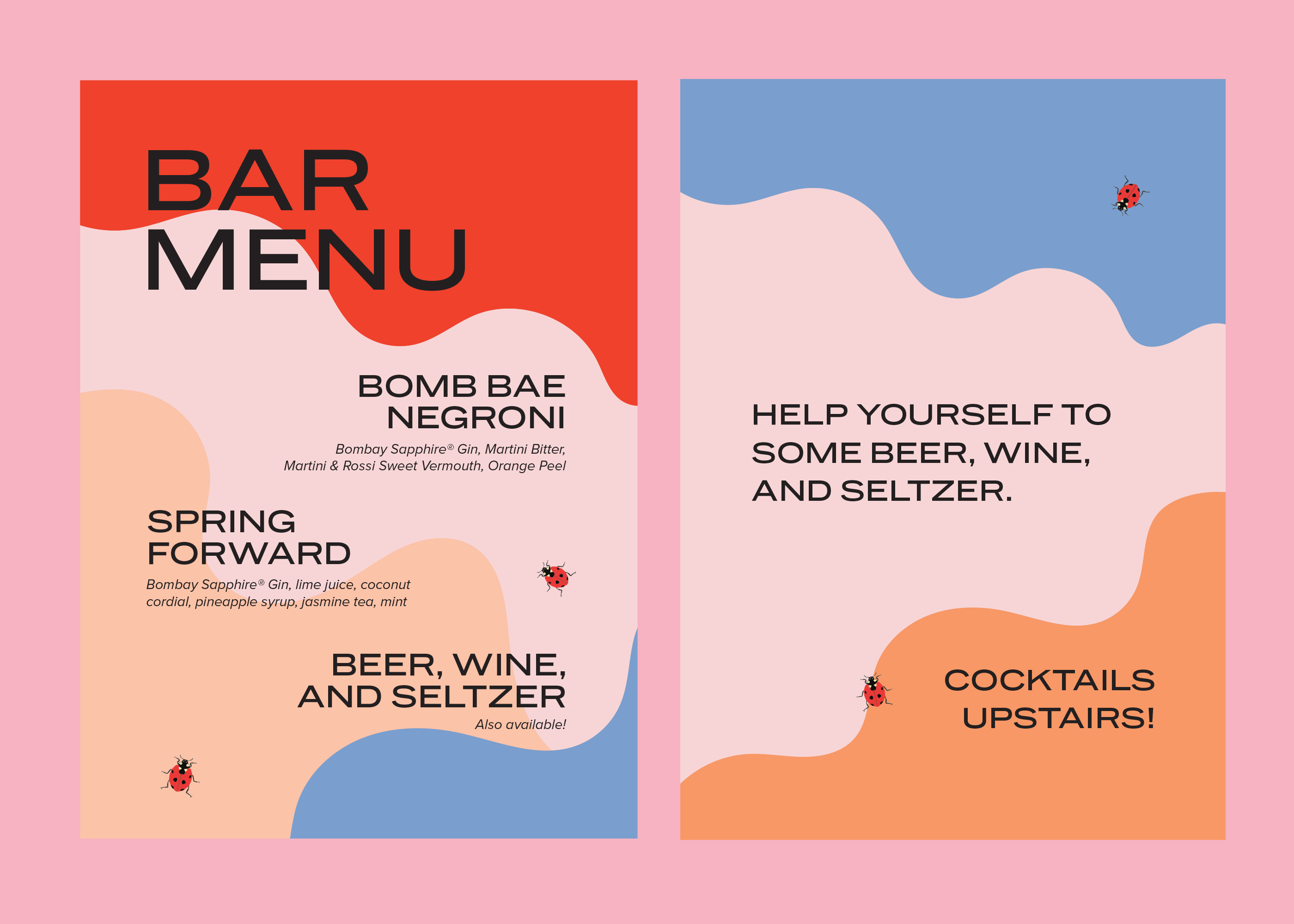
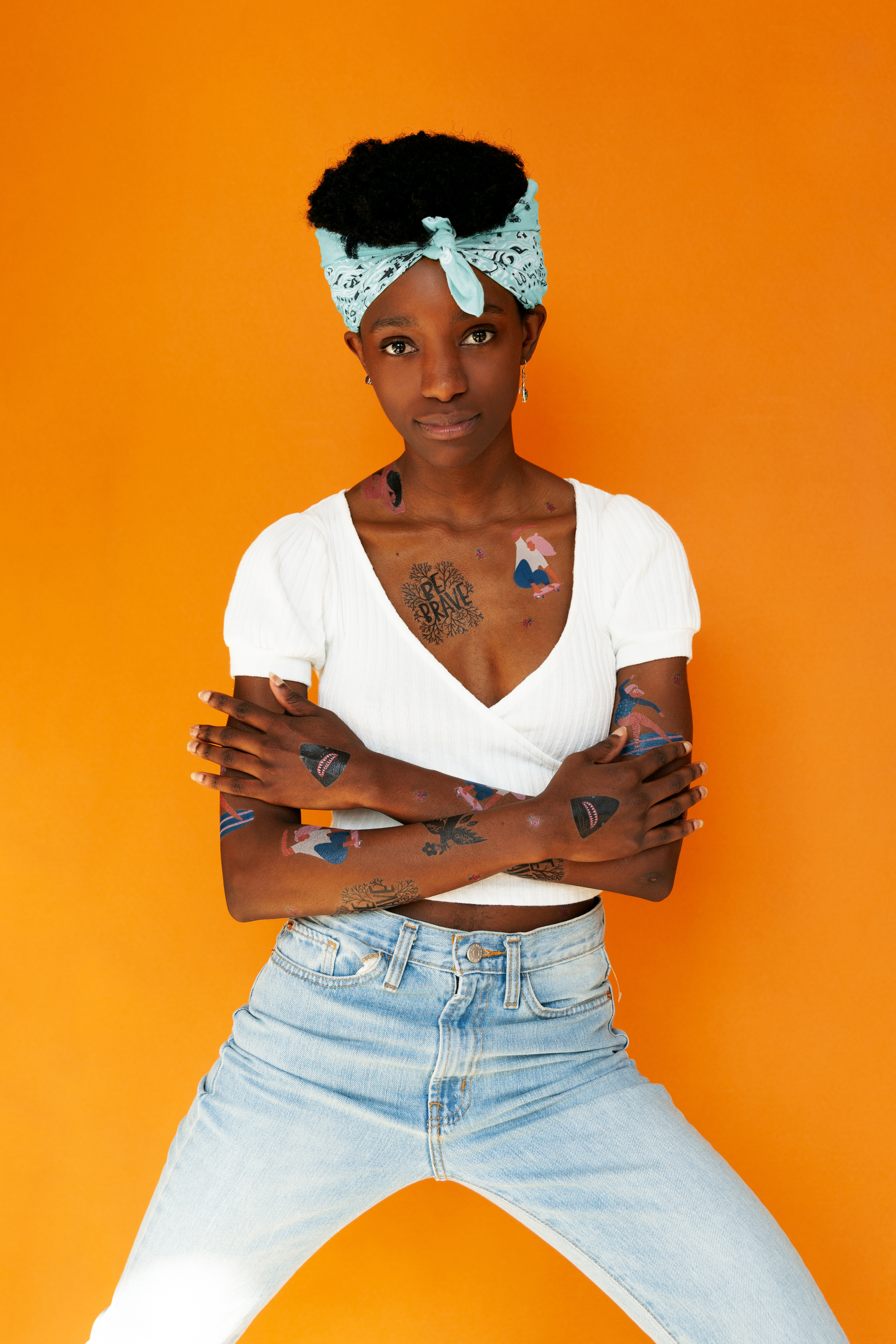
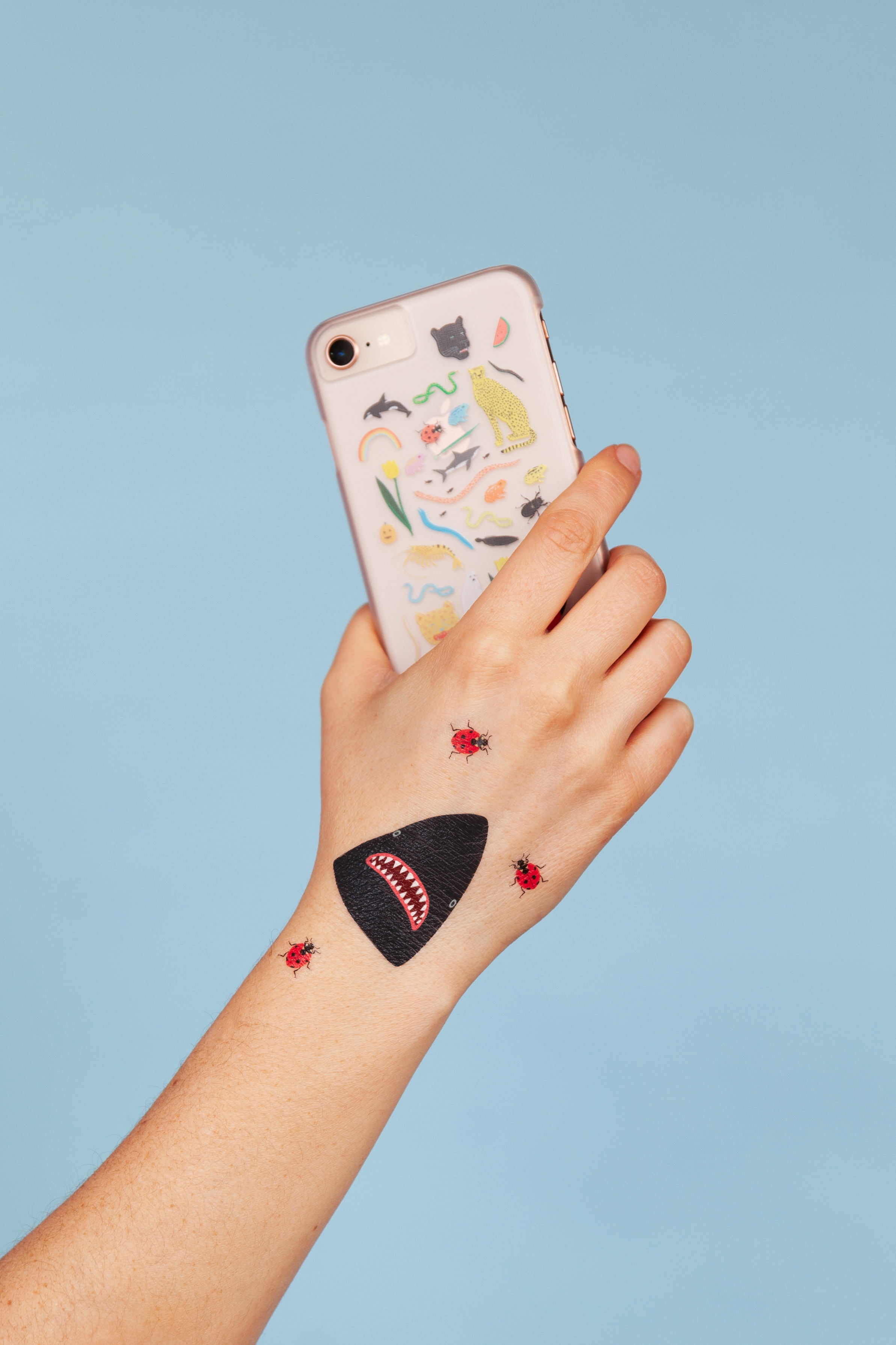
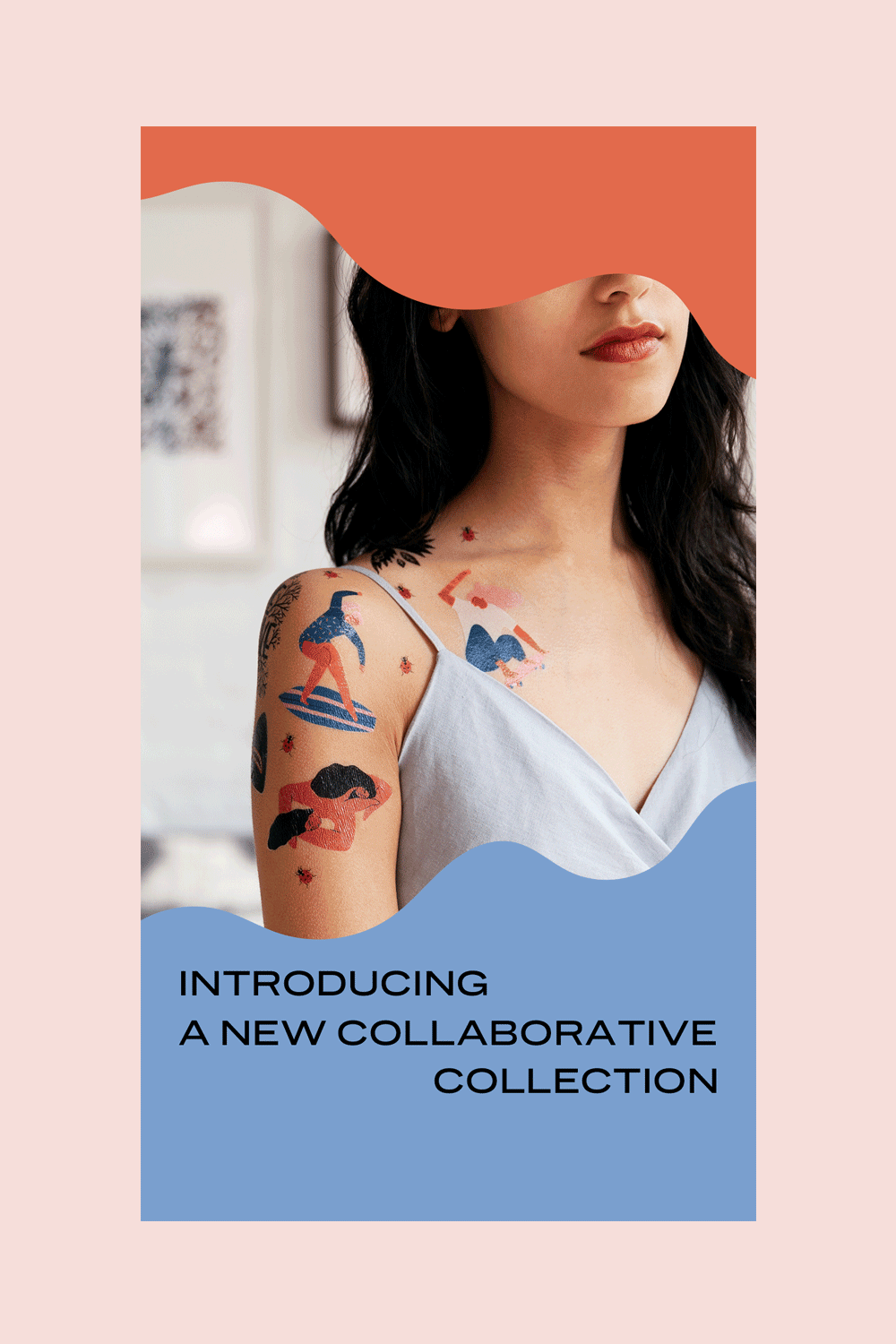
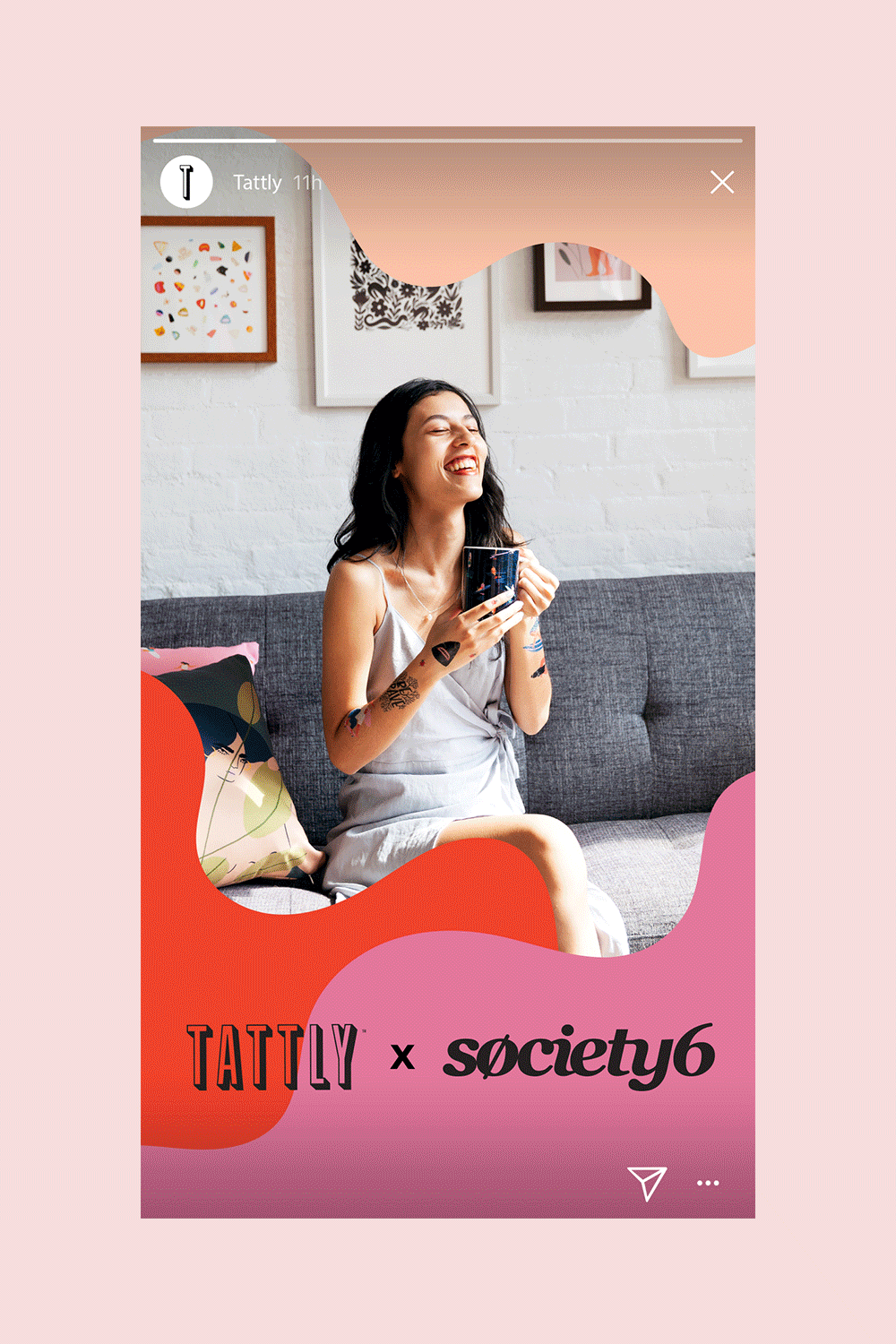
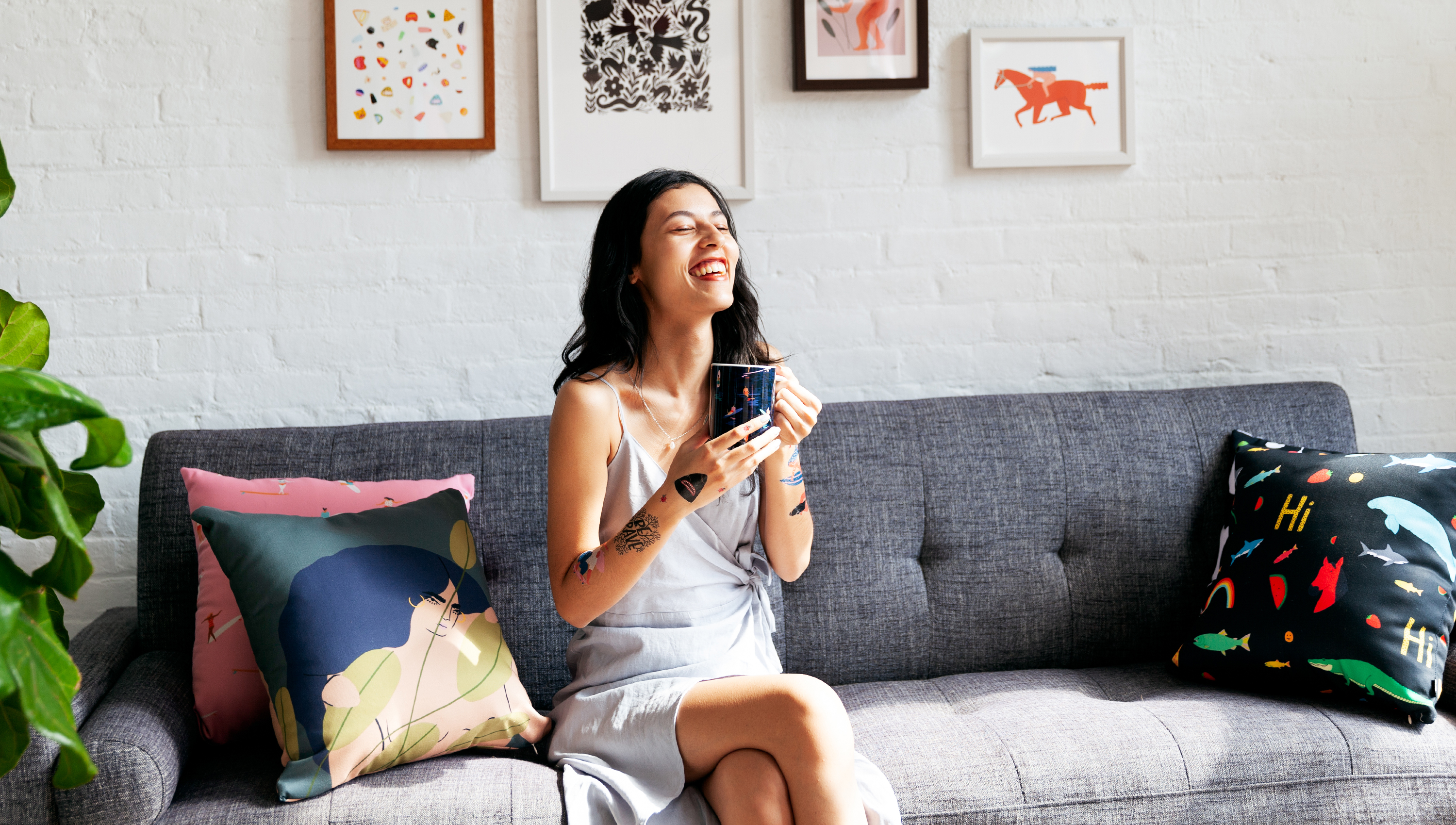
Tattly x Society6
For the first time, Tattly teamed up with Society6 to turn a special collection of their artists’ work into wearable art. Seven debut designs capture in tattoo-form the unique perspective of four Society6 artists, who are joining a long list of Tattly Artists who also sell on Society6. The visual system and launch campaign work I developed uses bold colors and shapes that transform with fluency to capture the fun of the collaboration.
Role: Designer
Photography: Natasha Janardan and Paul Jun.


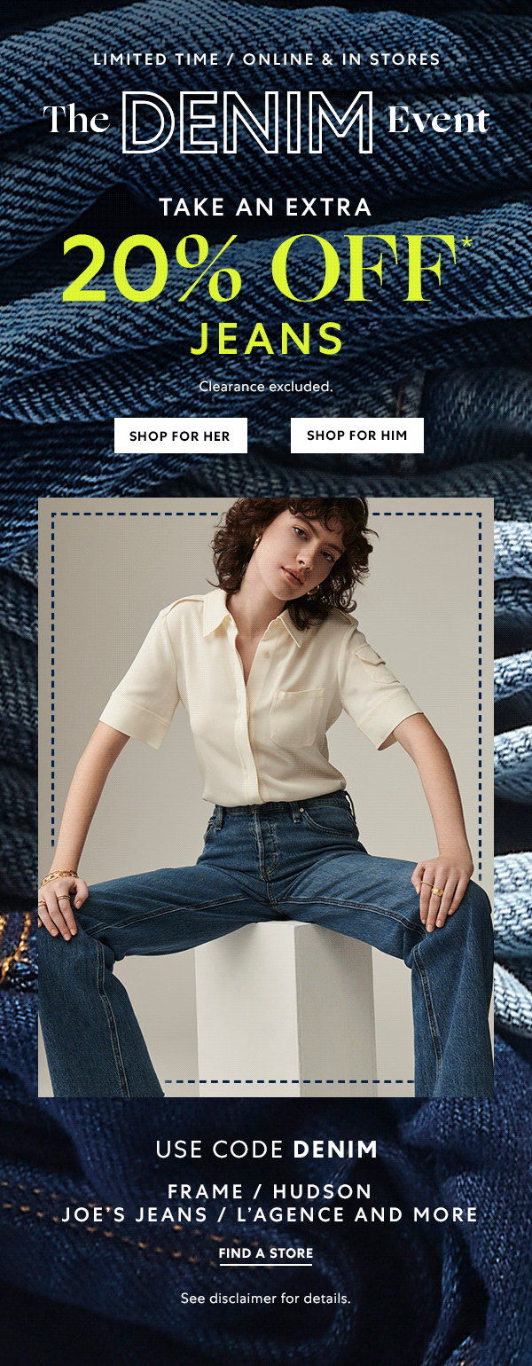
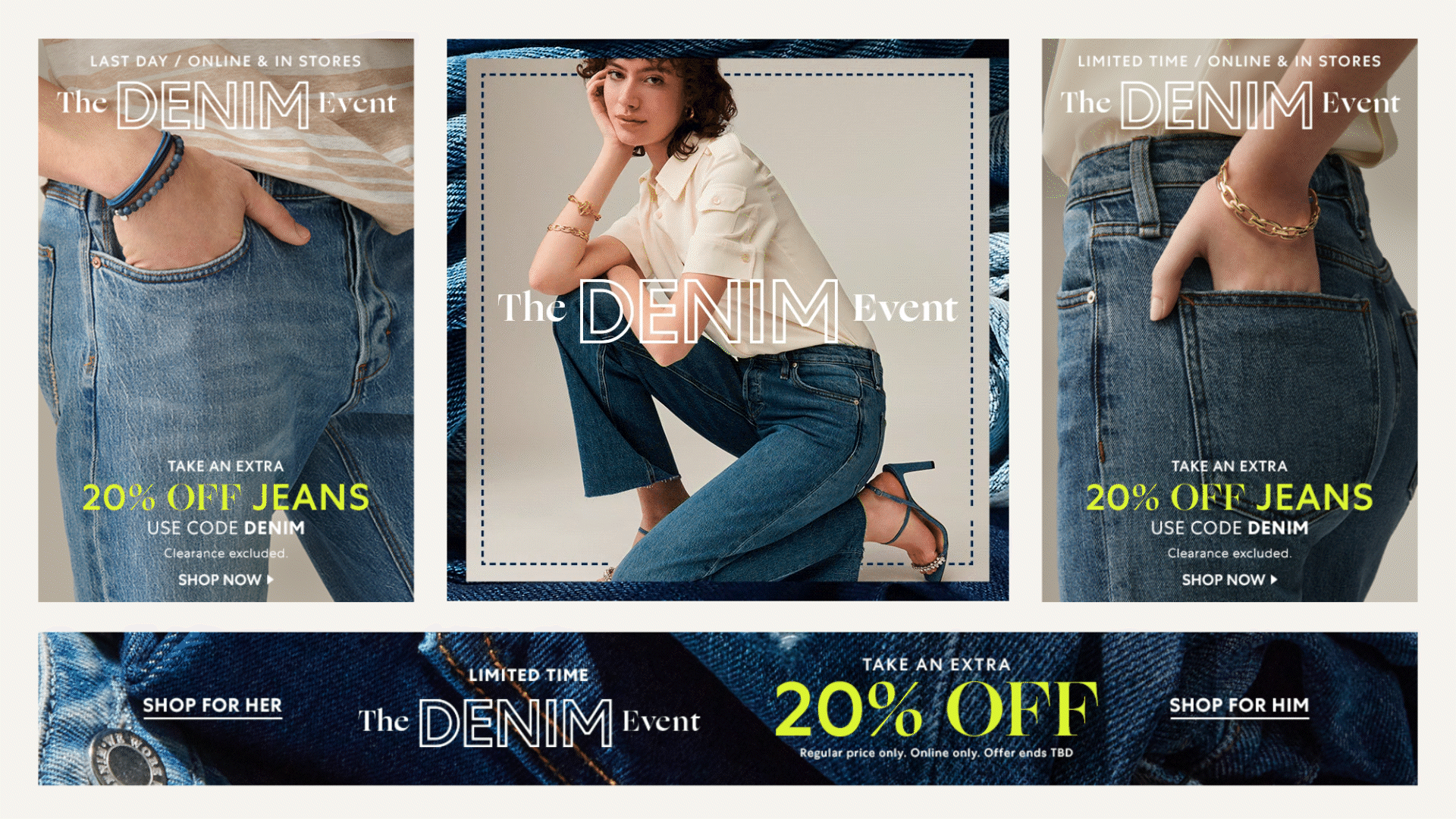
Saks Off 5th Campaigns
Saks Off 5th is an off-price department store sister brand to the luxury department store chain Saks Fifth Avenue. In collaboration with the design manager, I created visually compelling assets for seasonal campaigns from pitch to rollout, ensuring designs aligned with overall marketing strategies.
Role: Freelance Senior Designer
Design Manager: Sasha Prood
Campaign materials for the Denim Event. Assets included email marketing, web banners, and site-supporting elements.

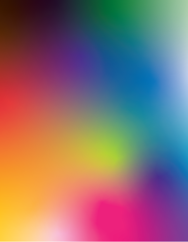
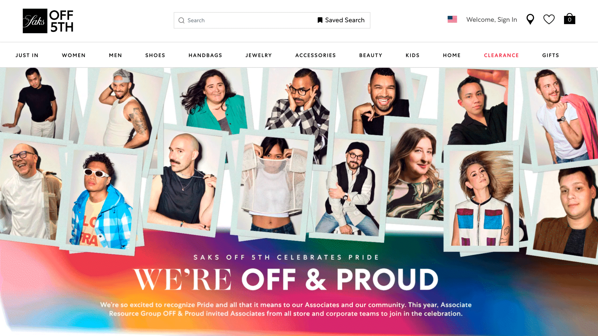
Promotional materials for Saks Off 5th Off & Proud campaign. Incorporating a series of fluid, colorful gradients that celebrated the vibrancy and inclusiveness of their initiative. Assets included email marketing, landing page, social media content, and site-supporting elements.
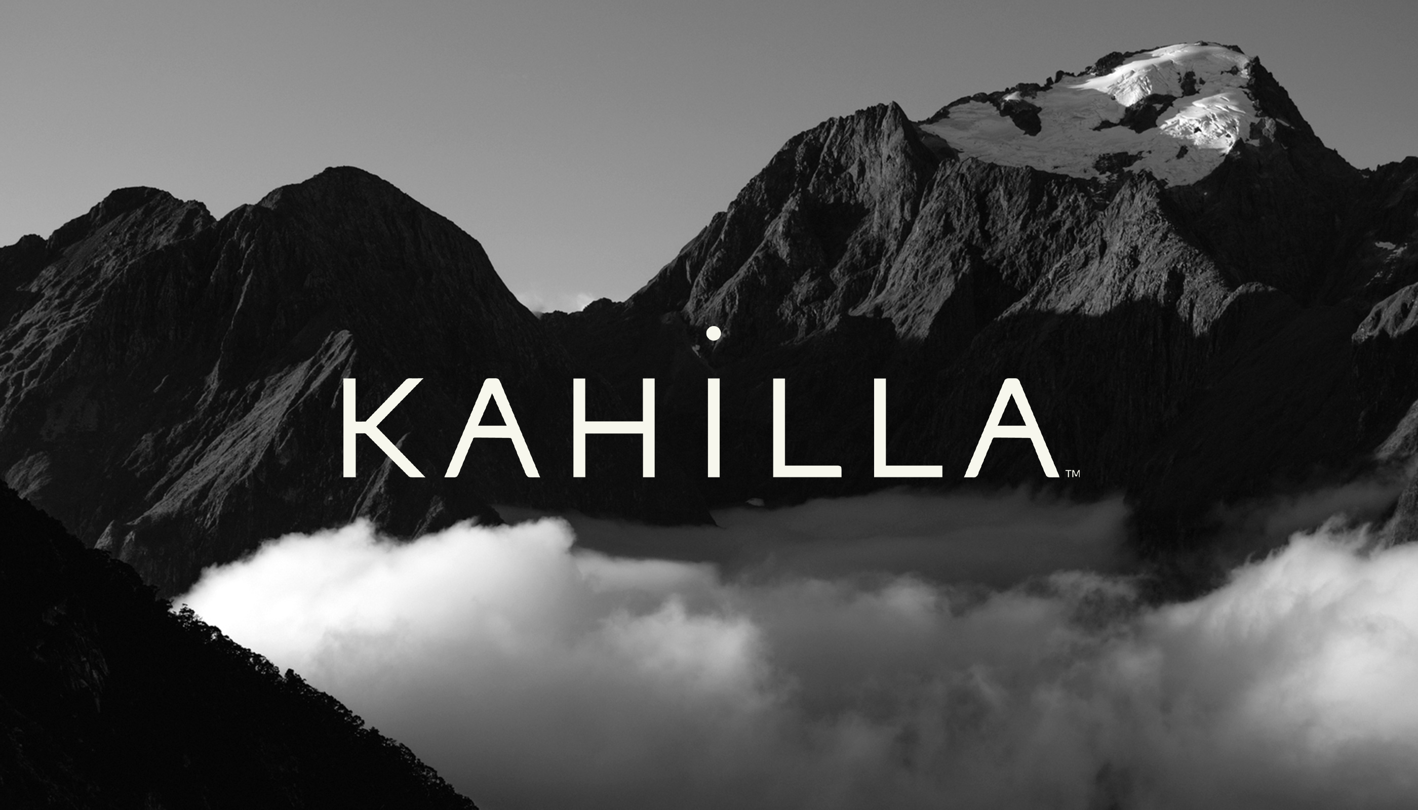
Kahilla
As The Nook Online’s founders prepared to scale their business model, we developed an identity to align with their company’s new name: Kahilla, which refers to a group of people united by a common goal. Starting with branding and extending into design, communications strategy, and messaging across all collateral—including Kahilla’s website—we articulated the company’s commitment to empowerment and inclusivity.
Role: Lead Designer
Studio: MA’AM
Creative Director: Sharon Taylor
Managing Director: Kristina Unker

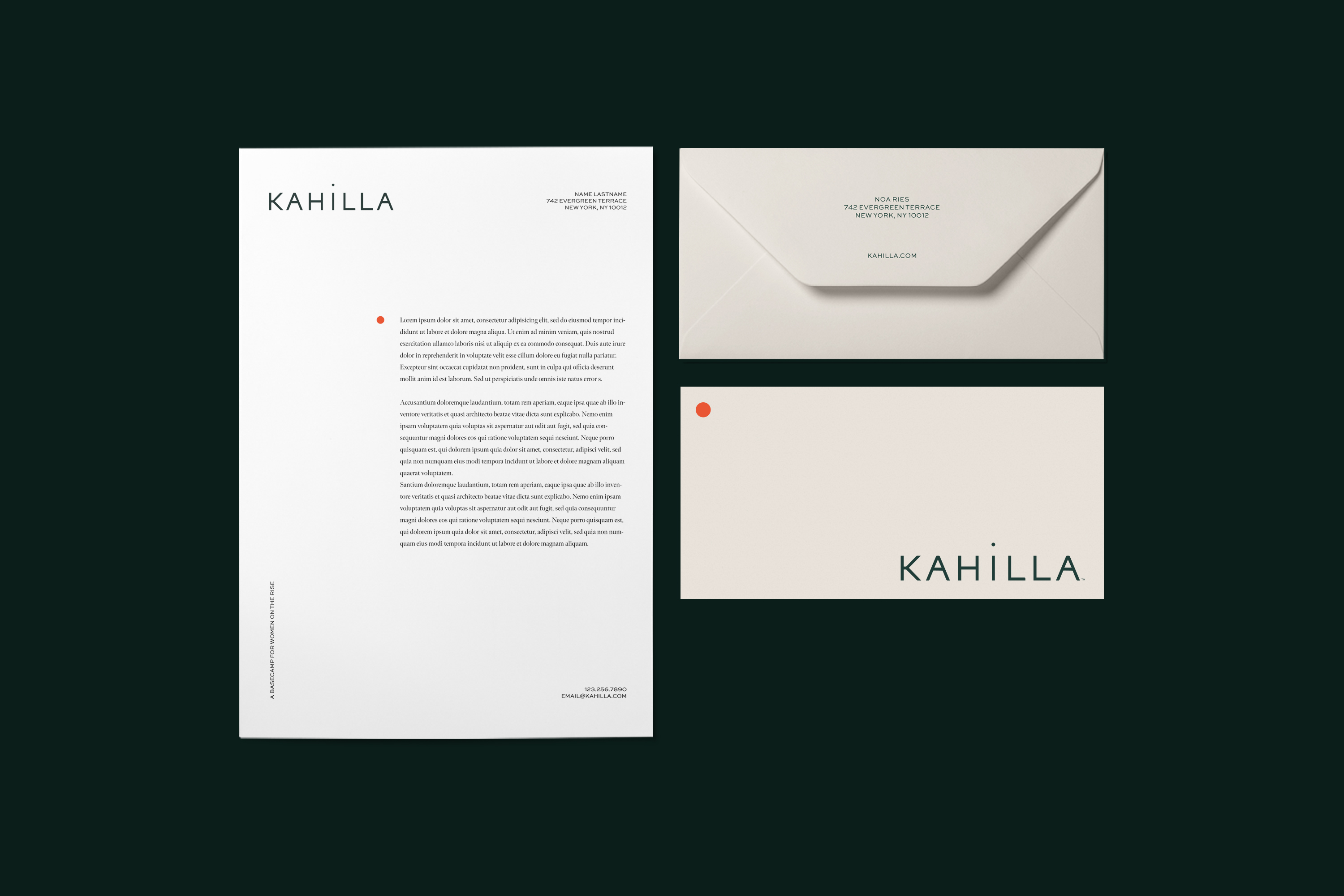
The Kahilla logo embodies community. Its solid, block letterforms infuse the wordmark with a strong and balanced foundation, while the elevation of its members is signified by the dot of the “i” rising above its base. Together, these elements express Kahilla’s identity as a “basecamp for women on the rise.”
The tagline is stacked and placed on the right side of the logo, with a vertical line mimicking a flag.
The brand icon (a circle) symbolizes the Kahilla basecamp and serves as a visual distinguisher, leading viewers on a webpage, highlighting headlines, and adorning foundational brand collateral.


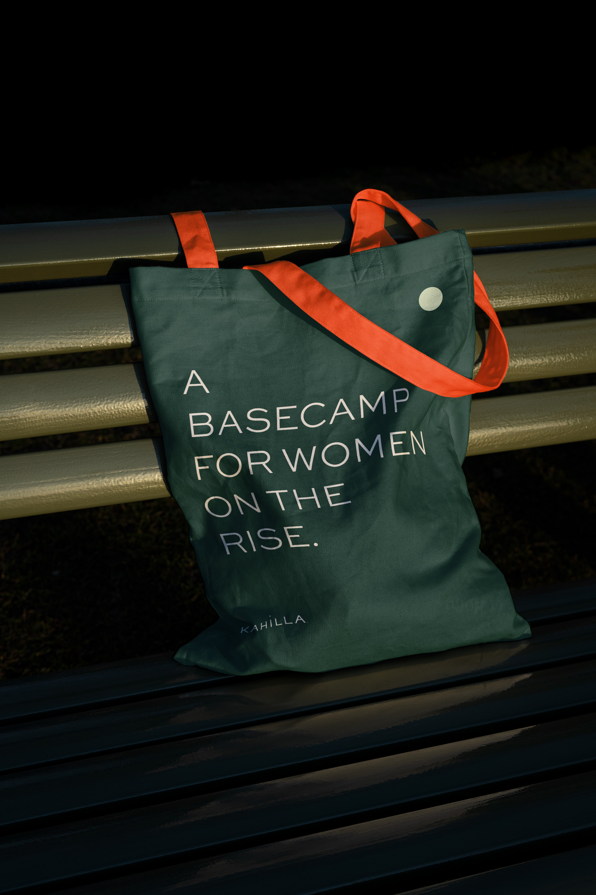
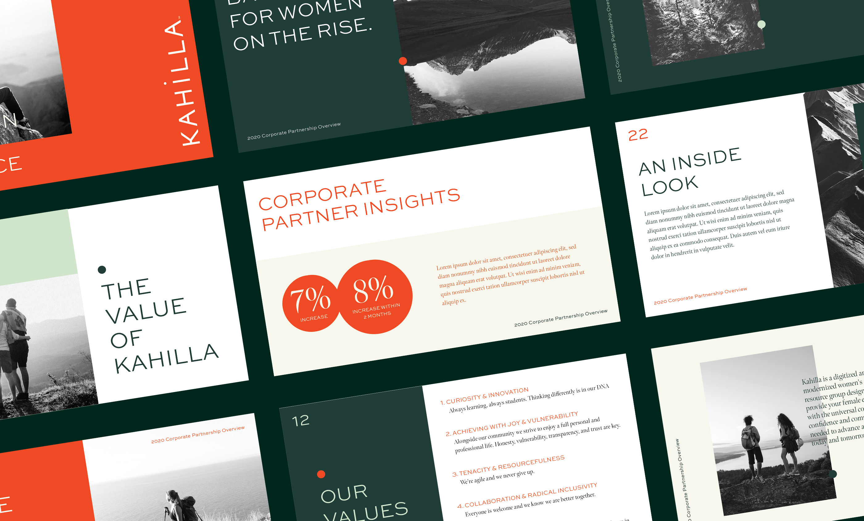


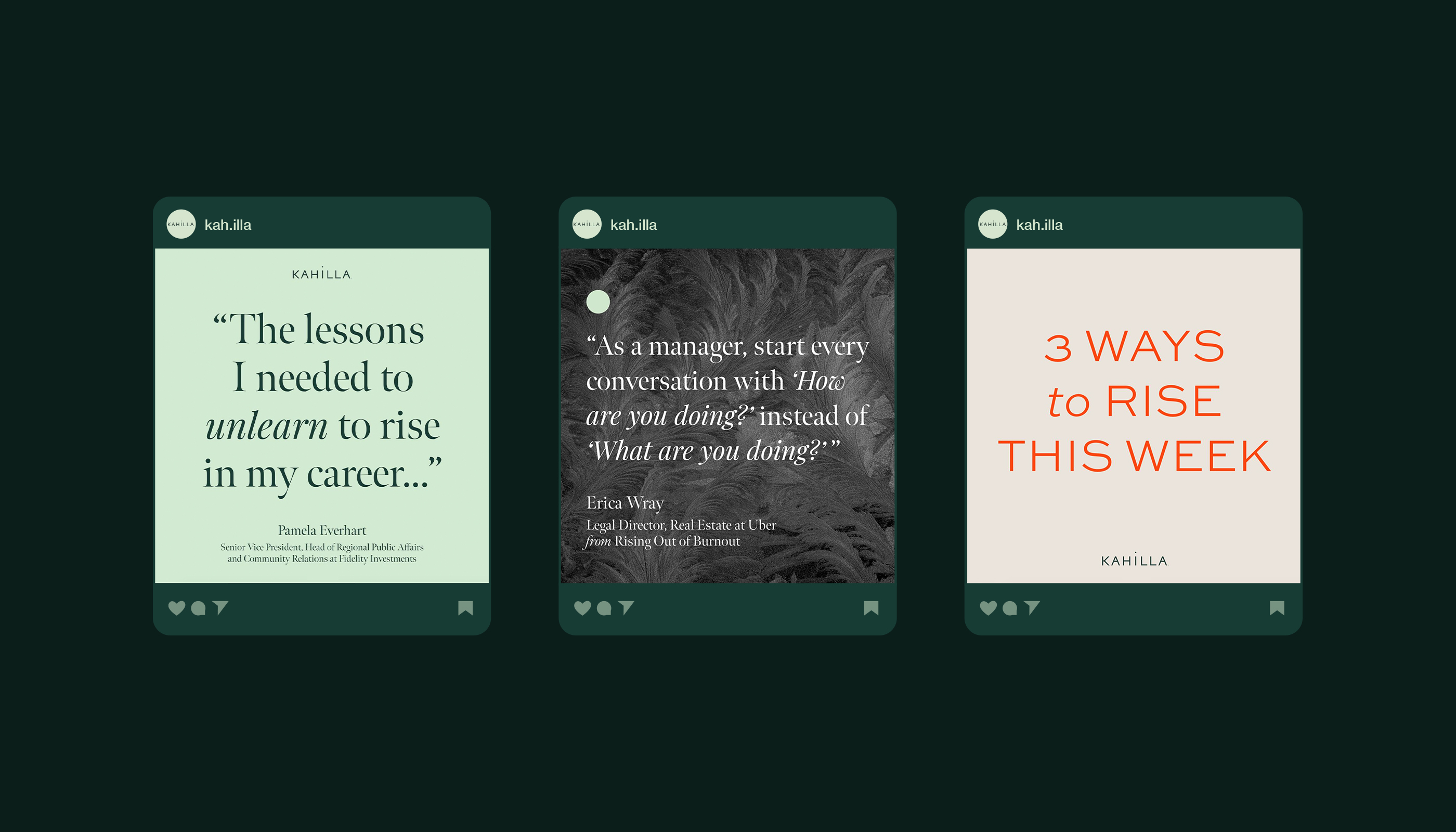
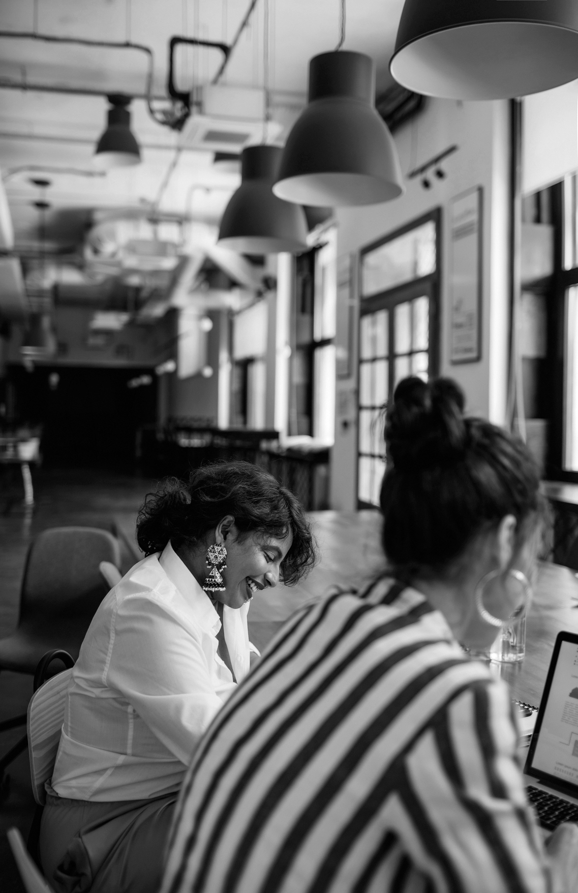

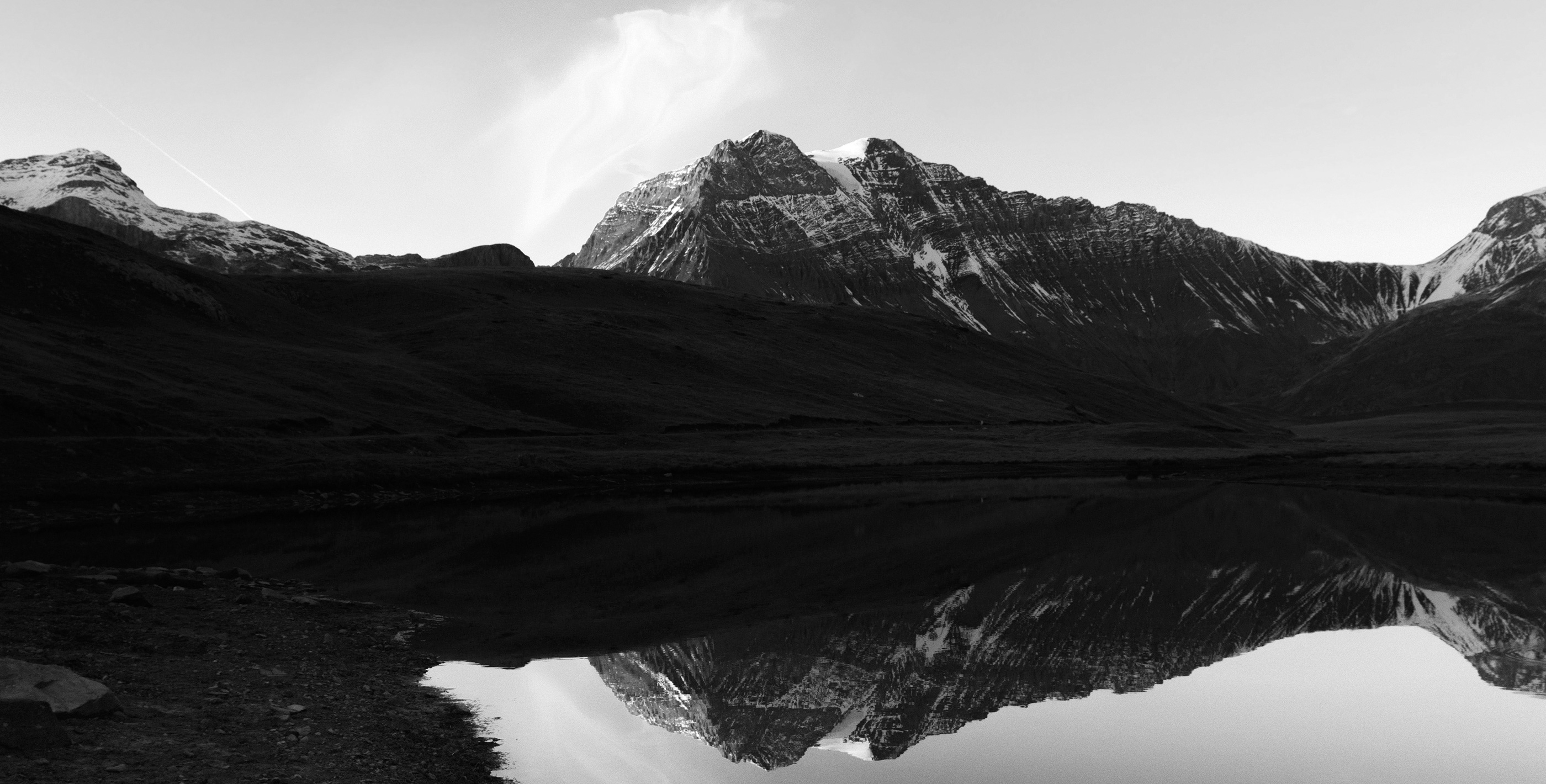
The photography direction reflects the feeling of community and nature through energetic and bold black and white photography.

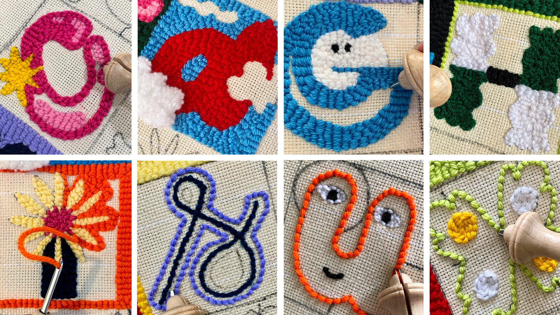
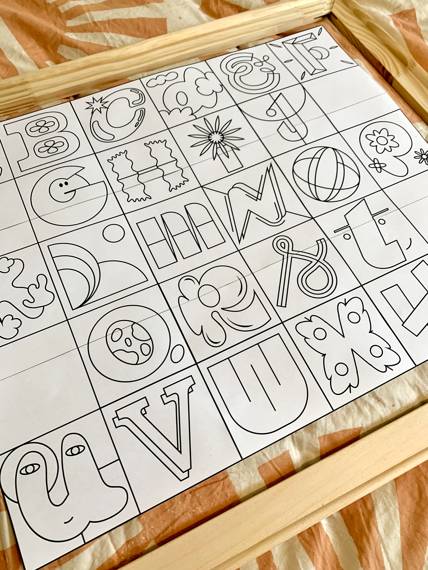
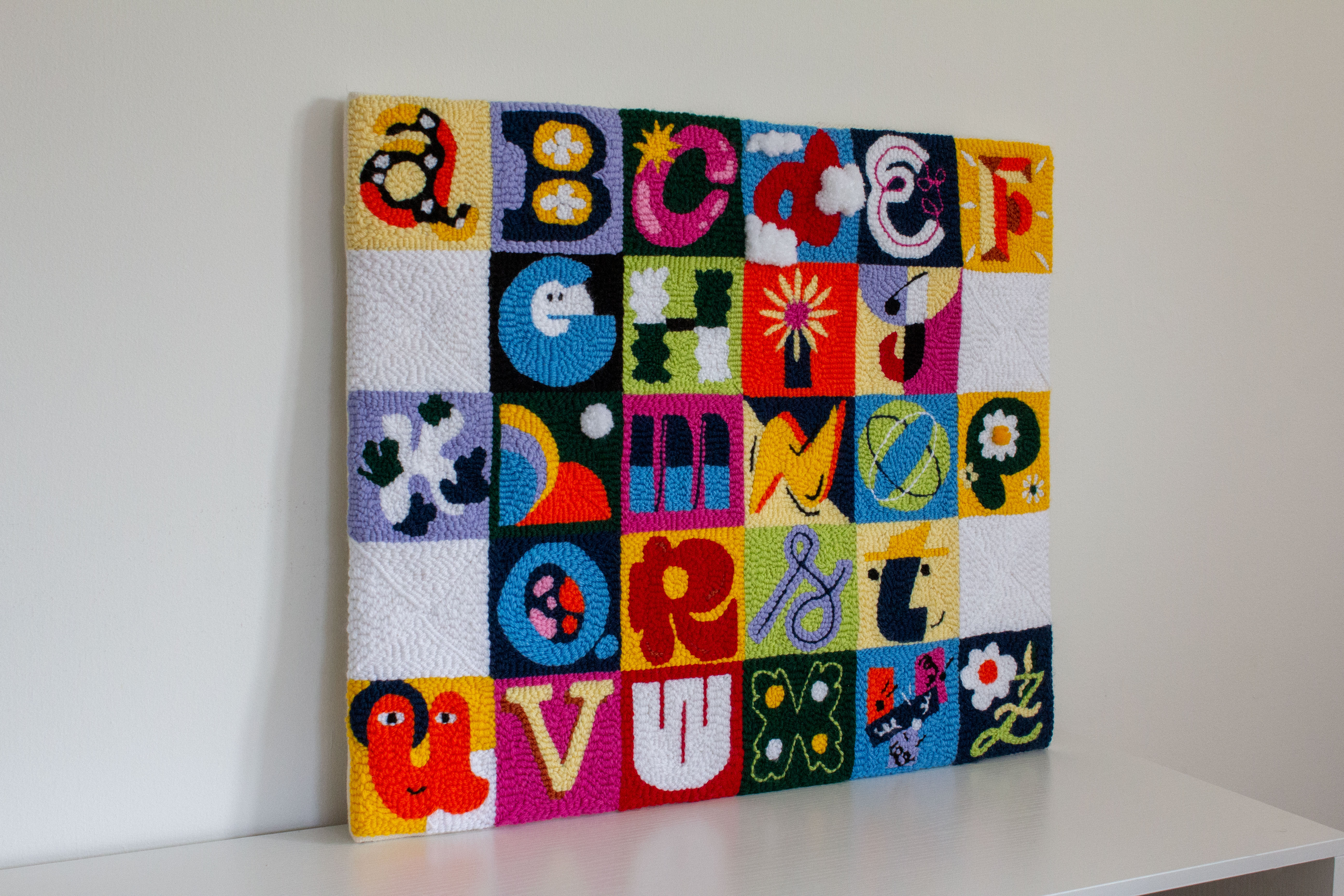
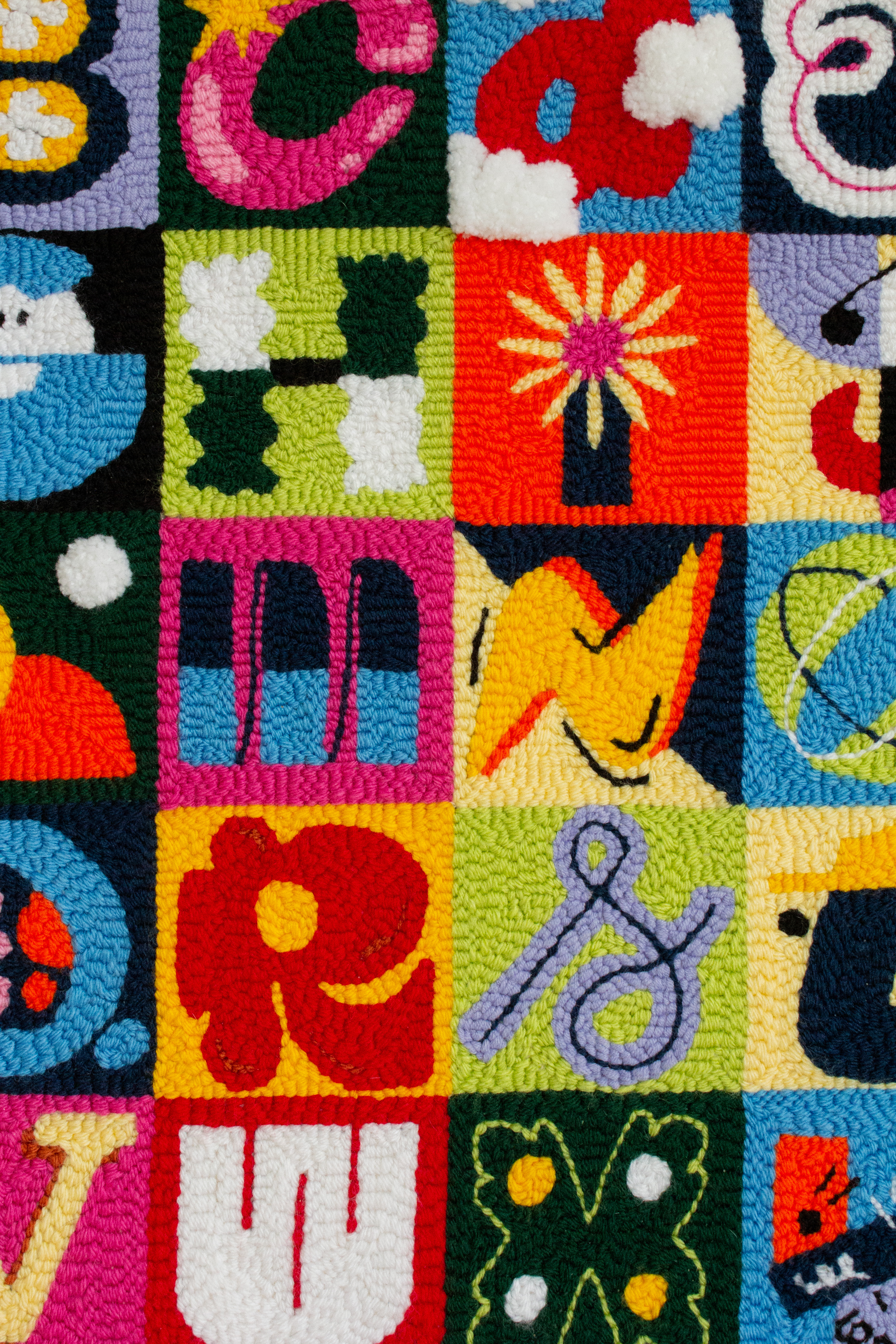
36 Days of Type 2023
For the 10th edition of 36 Days of Type, I created each letter of the alphabet using the punch needle technique. I took different approaches to develop each letter, from abstract designs associated with a specific letter to more conventional shapes. Each design explores and plays with different aspects like dimensionality, color combinations, and geometric and organic shapes. The result is an interactive typographic poster that showcases the versatility of the punch needle technique and allows everyone to feel and interact with each letter.
Role: Design & creative direction